Design system for a green-field data integration platform

Establishing Celigo’s first design system alongside the product itself

I design end-to-end product experiences and the UX systems that sustain them — from early foundations through growth, optimization, and scalability.

Initial company and product state

Initial company state

Celigo was a Series A SaaS startup focused on helping customers automate data movement between enterprise systems. I joined as the first product designer, partnering directly with product and engineering to define not just the interface, but how the product itself would scale.

The company’s success depended on enabling customers to build and maintain complex integrations independently, without professional services—yet the product was still in its earliest stages.

Initial product state

At the time, most of the product did not yet exist.

There was:

  • A proof-of-concept flow builder composed largely of long, dense forms
  • No established interaction patterns for building, branching, or validating flows
  • No flow mapper, no code editor, no branching model, and no scripting UI
  • No shared standards for layout, components, typography, color, or state handling

Rather than refining existing interfaces, the challenge was to design a system that could support features we didn't even know about yet.

Challenge

Create a scalable design system that could:

  • Support unknown future workflows (flow mapping, scripting, branching, validation)
  • Scale from simple configurations to highly complex automation scenarios
  • Reduce cognitive load in inherently technical, configuration-heavy experiences
  • Establish consistency without constraining product exploration
  • Move fast enough for a Series A startup while remaining durable over time

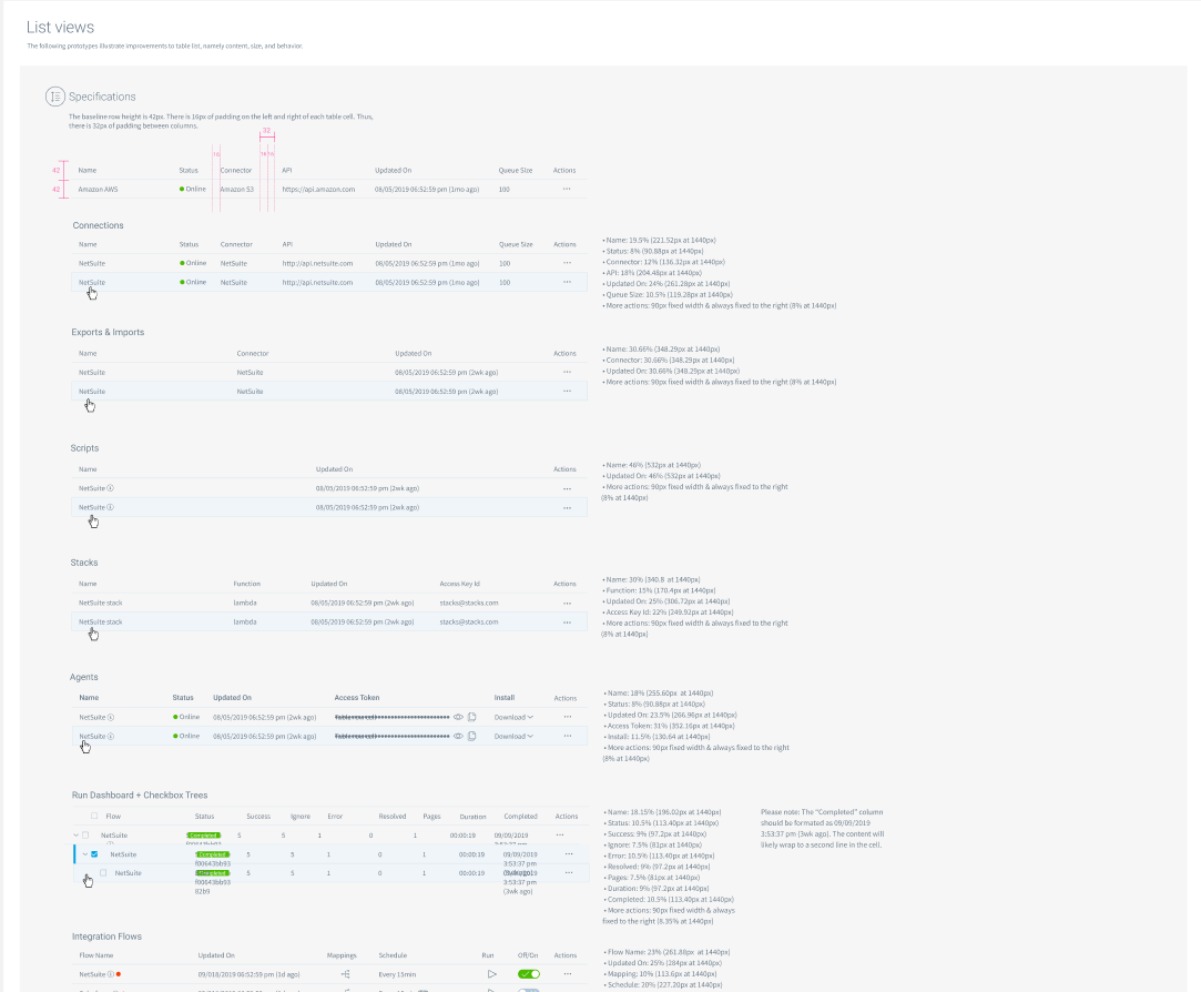
This system needed to function as UX infrastructure, not just visual consistency.

Designed for future workflows, not current screens

Instead of designing around existing UI, I modeled the system around conceptual primitives:

  • Objects (flows, connections, mappings)
  • States (configured, invalid, running, errored)
  • Actions (edit, validate, test, deploy)
  • Hierarchies (global → flow → step → field)

This allowed future features—like the flow mapper, code editor, and branch logic—to emerge naturally within an established framework rather than forcing redesigns later.

Established foundational patterns early

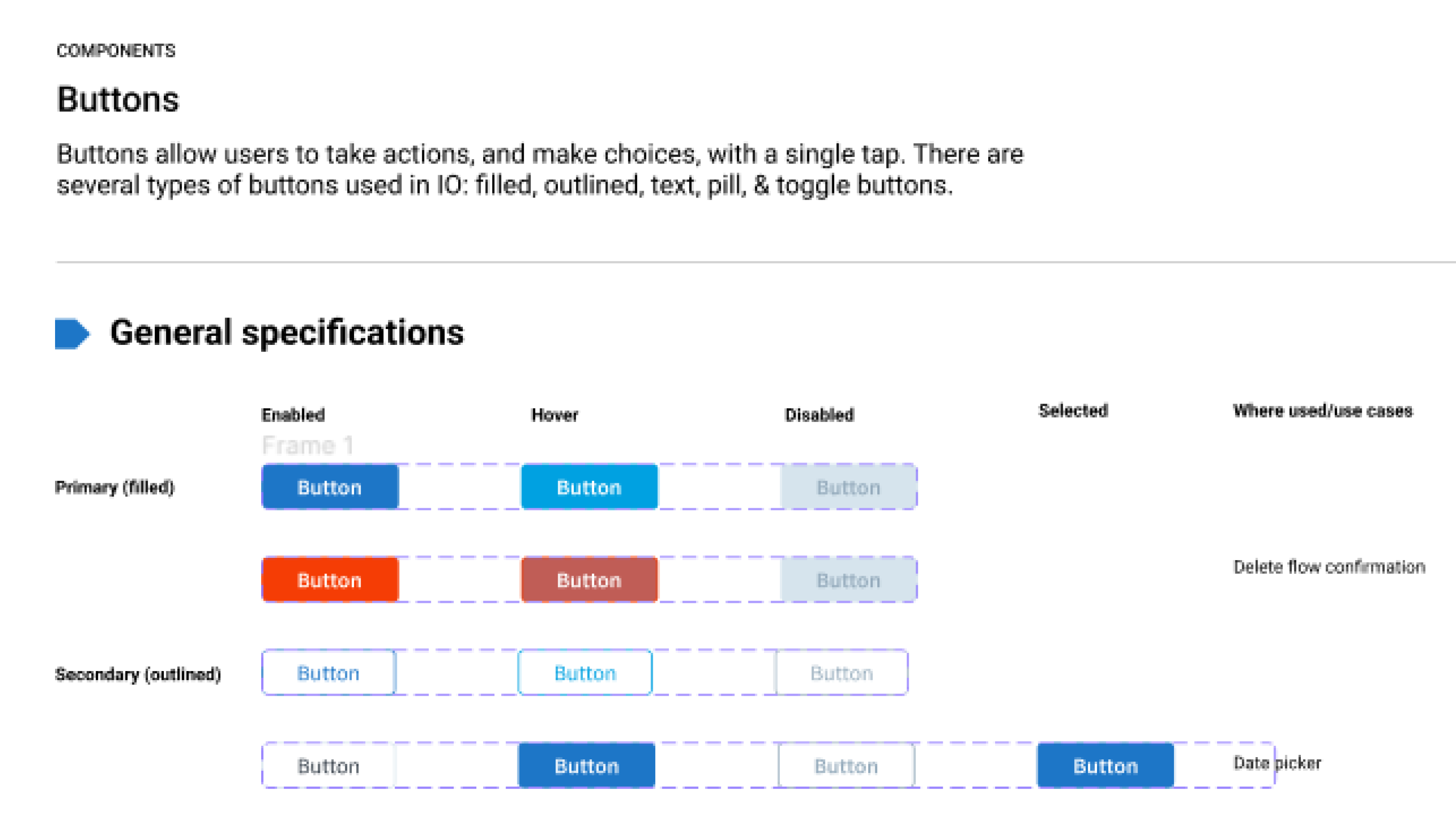
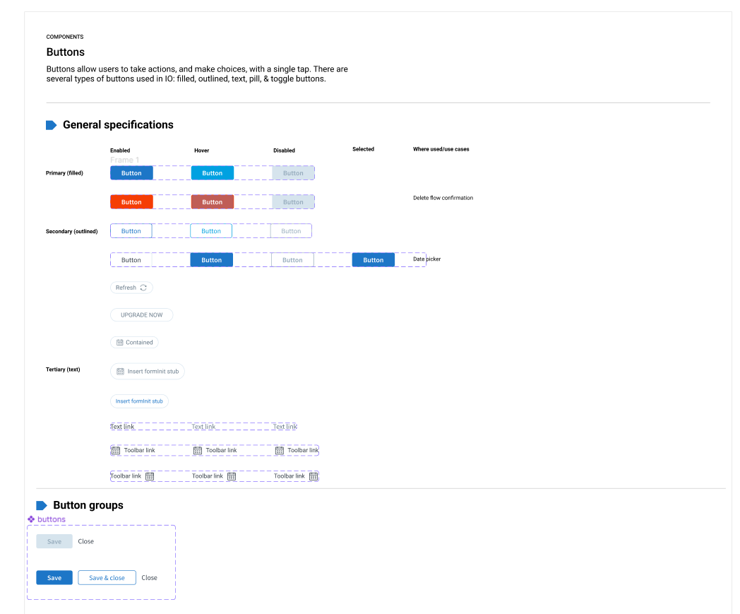
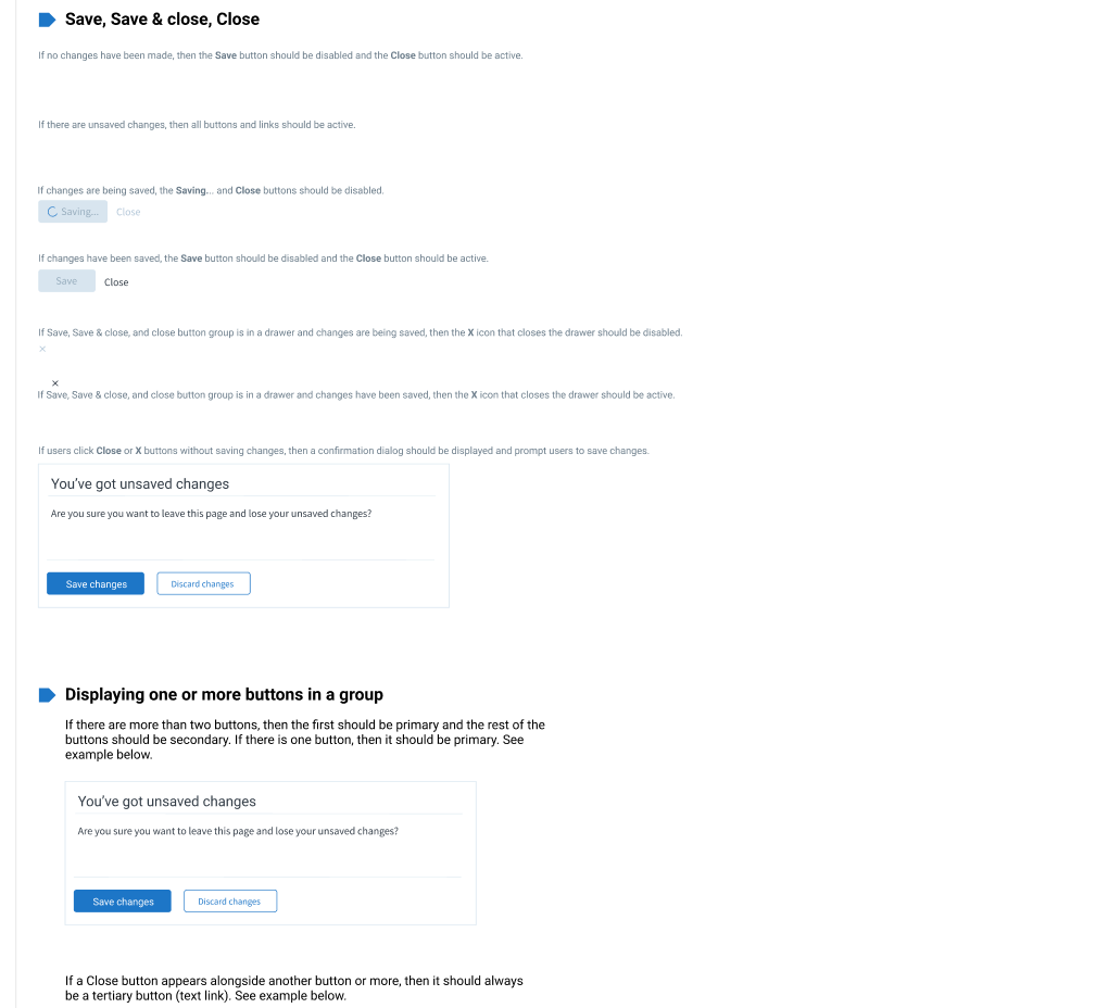
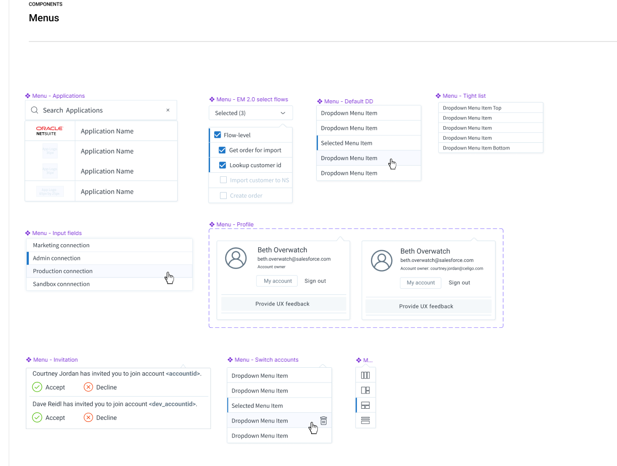
I created system-level decisions that could be reused everywhere:

  • Layout and spacing tuned for dense, form-heavy interfaces
  • Clear hierarchy rules to prevent visual overload
  • A semantic color system for execution states, validation, and errors
  • Typography optimized for scanability in long configuration flows
  • Reusable containers, panels, and navigation patterns

Material UI served as a starting point, but required significant customization to handle Celigo’s domain-specific complexity.

Reduced cognitive load in proof-of-concept UI

Even before advanced features existed, the system:

  • Introduced consistent form grouping and labeling
  • Standardized validation and error presentation
  • Used progressive disclosure for advanced configuration
  • Created predictable interaction patterns users could learn once and reuse

These decisions directly informed later designs for mapping, scripting, and branching.

Embedded accessibility from the start

The system:

  • Met WCAG AA contrast standards
  • Avoided color-only status indicators
  • Used consistent affordances for focus, error, and state changes

Accessibility was treated as foundational, not a retrofit.

Designed to evolve with the product

Because the product itself was evolving:

  • Documentation was pragmatic and lightweight
  • Patterns were flexible rather than rigid
  • I partnered closely with engineering to ensure components could be reused as new features emerged
  • The system evolved in parallel with product discovery and delivery

Sidebar

Colors

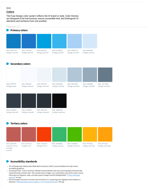
Created color palettes for main production flow environment as well as sandbox environment.

Headings

Icons

Line graphs

Lists

Buttons

Logos

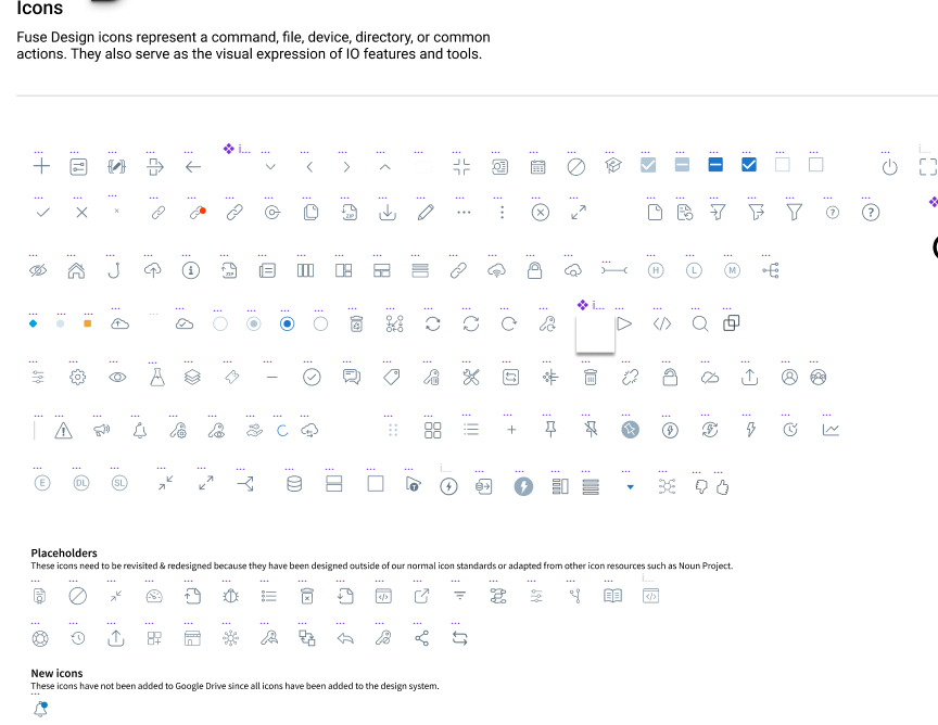
Our integration platform showed the logos of the applications that were involved in the flow, allowing for quick identification.

Menus

Panels

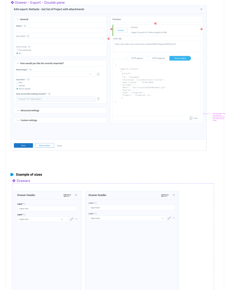
There were several sizes of panels, or drawers as we called them internally.

Avatar and account drop-downs

Impact

  • Established Celigo’s first UX and design system foundation and UX infrastructure before major product features existed
  • Enabled future development of the flow mapper, code editor, and branching logic without redesigning core patterns
  • Reduced fragmentation as the platform rapidly expanded
  • Reduced cognitive burden for users configuring complex integrations
  • Created shared language and structure across design, product, and engineering
    Enabled engineering teams to ship faster with fewer one-off UI decisions
  • Allowed Celigo to scale from early proof-of-concept to a mature integration platform without accruing UX debt, supporting Celigo’s growth into a Gartner Magic Quadrant Leader