Projects
Projects

I design end-to-end product experiences and the UX systems that sustain them — from early foundations through growth, optimization, and scalability.
The company was expanding its cybersecurity platform to include device provisioning and certificate management—a critical capability for medical device manufacturers operating under strict regulatory and security requirements. I joined this medtech cybersecurity startup as the first designer, working during an early and critical phase of the company’s growth.
Although this product constituted the majority of the company's revenue, there was no UI. This needed to be created in days. I operated across product design, product management, and technical writing. This work needed to ship quickly to support customer commitments, leaving little room for iteration after release.
There was no existing UI for device provisioning. Backend capabilities existed, but there was no defined user experience for:
The workflow was inherently technical, with high risk if misconfigured, and required a clear, guided experience to be usable by security and engineering teams.
This required:
I designed and delivered the full device provisioning and certificate management experience end to end—defining workflows, system feedback, and interaction patterns to support secure device onboarding from day one. I created the entire UI and help center in around a week.
As a team of one, I worked across multiple products simultaneously, fulfilling many roles:
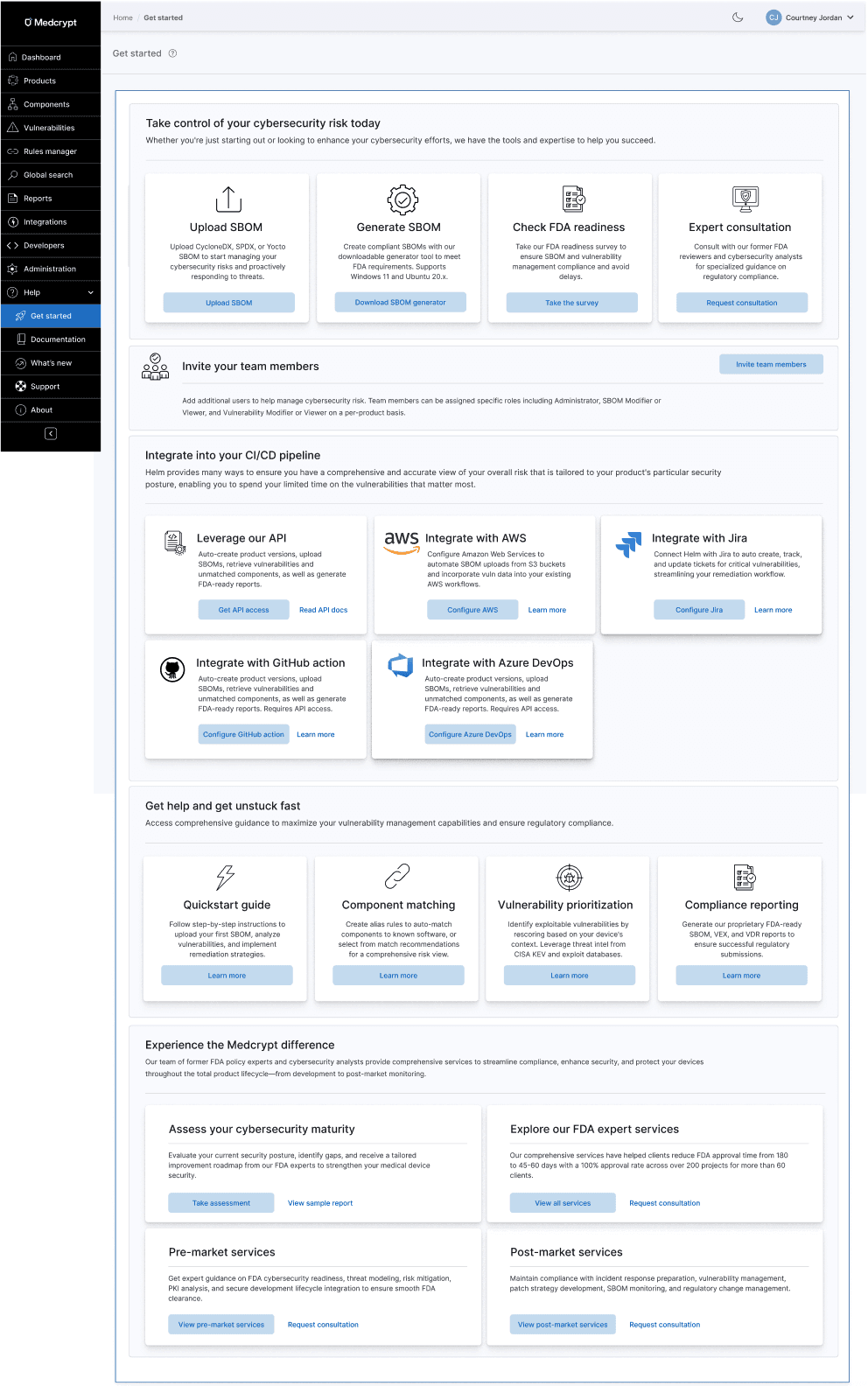
I created onboarding emails, a get started hub, and a help center.
I unfortunately don't have a copy of the get started hub, but it had the same layout as the one for the SBOM vulnerability management platform, which I am showing below for context.
I built the help center from the ground up (in Gitbook), which can be viewed here: https://docs.medcrypt.com/

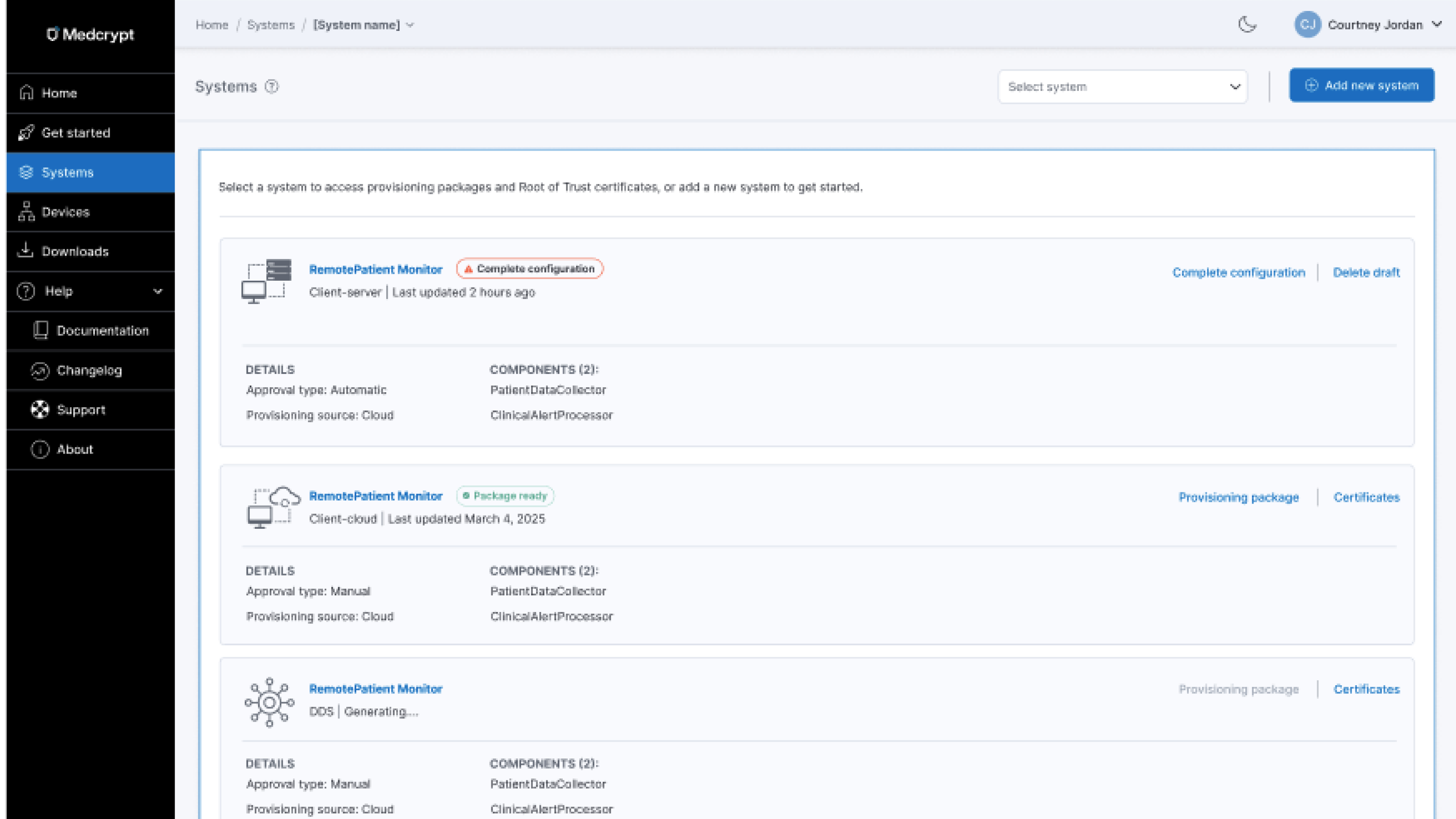
This was the first iteration of breadcrumbs, where users could select a particular system. It was planned to allow selecting multiple systems, and for the breadcrumb to scale up to include showing device and certificate currently being viewed.

The UI needed to support row-level actions as well as bulk actions.

Users needed to be able to switch between date formats

Global provisioning was planned for the next phase. My scalable design system made adding this functionality a snap.

A top customer complaint with the current back-end functionality was that they had to request device status reports from the company. The UI ensured users always understood current state as well as historical statuses of each device.
Why tables?
Although I was working on a nested card interface (which you can see below in certificate management), our original design needed to be a table, to reuse the existing table pattern. I determined what information needed to be in the table (and what could be on-demand), the device provisioning flow, next steps, bulk actions, filtering, and more. I had to make millions of decisions very quickly, so kept track of them in cards, then transferred them to the PRD when everything was finalized.

Because we were constrained to leveraging the existing table from the design system due to the quick turnaround, and companies could have hundreds of thousands of devices and certificates, I devised a filtering mechanism to ensure users could get to what they needed quickly.

Nothing was defined, so I needed to determine what an device provisioning approval flow would look like and the happy and unhappy paths.

Building on what I'd already established for the SBOM vulnerability management platform, I adapted it for this product's needs, determining states and what to call them, ensuring that system status was clear and users understood next steps.
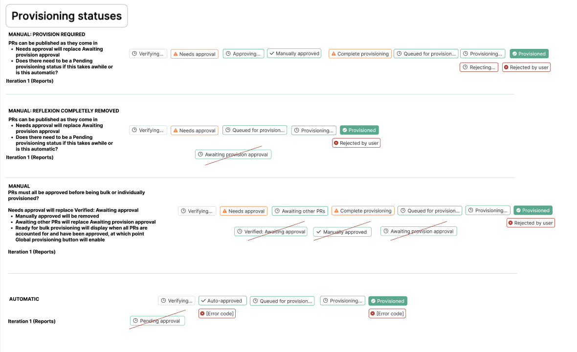
Badges brought clarity to the number of possible error codes, as well as how the user could recover from an error. For the first iteration of the UI, it was determined that attempting to reprovision the device was the only current avenue, so I made sure that errors and any recovery options were clearly documented in the help center.

Each device had available actions depending on where in the provisioning process it was.
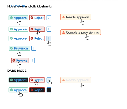
To reduce cognitive burden and the possibility of errors, I designed confirmation panels that brought forth all necessary information to enable user to confidently confirm single or bulk device provisioning approval or rejection.

For simler actions that did not need to bring forth device and certificate information, I created confirmation modals and corresponding toasts so that users understood what to expect, didn't lose their work and could quickly pick up later.

After confirming an action, users can immediately see the status of their action. They can also close the modal, which will continue the process in the background, displaying a processing indicator on the main page.

For every user or system action, users always know exactly what's happening, what was successful, and what was not.

Since some processes could take a while (some still relying on manual efforts behind the scenes), toasts indicated the current state of a system's provisioning status.

Confirmation modals make sure users don't lose work or accidentally perform irreversible actions.
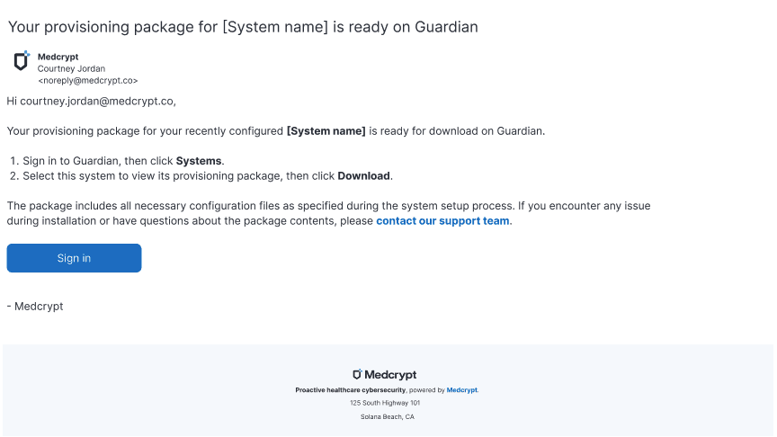
When a provisioning package was ready, users would receive a email with next steps.
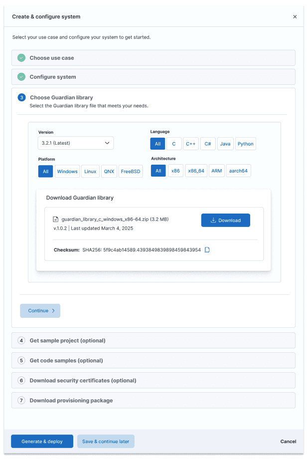
After creating the system, users could provision devices to that system. Users could select from the most common use cases, upsell to a custom integration, configure their system, download security certs, and download their provisioning package.

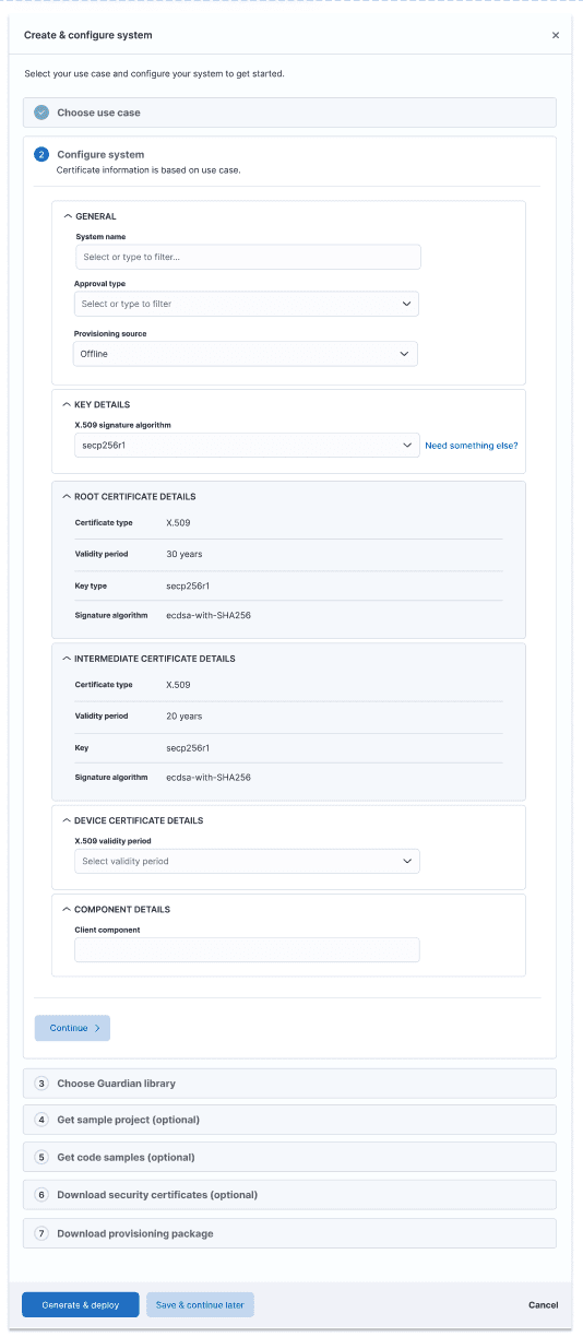

After configuring the system, users could review what they were about to provision. For this first iteration of the UI, they could not change the configuration, which is why there is no Back button.

Systems would show their current state, whether a provisioning package was available, the system was deployed, or system configuration was not yet complete, ensuring users knew what needed their attention.

Certificate management was a new functionality even to the back-end, so I had to research certificates to understand certificate types, levels of nesting, what information certificates contained and what was most important to surface at the card level vs what could be in the detail panel. This enabled users to understand certificate structure, status, and certificate details at a glance, as well as exporting certificates for importing into other systems, for example.
If a system was not provisioned yet, no certificates would show.

Users could understand certificate nesting structure, which was important since if a root or parent intermediate certificate expired, all child certificates would be temporarily suspended.
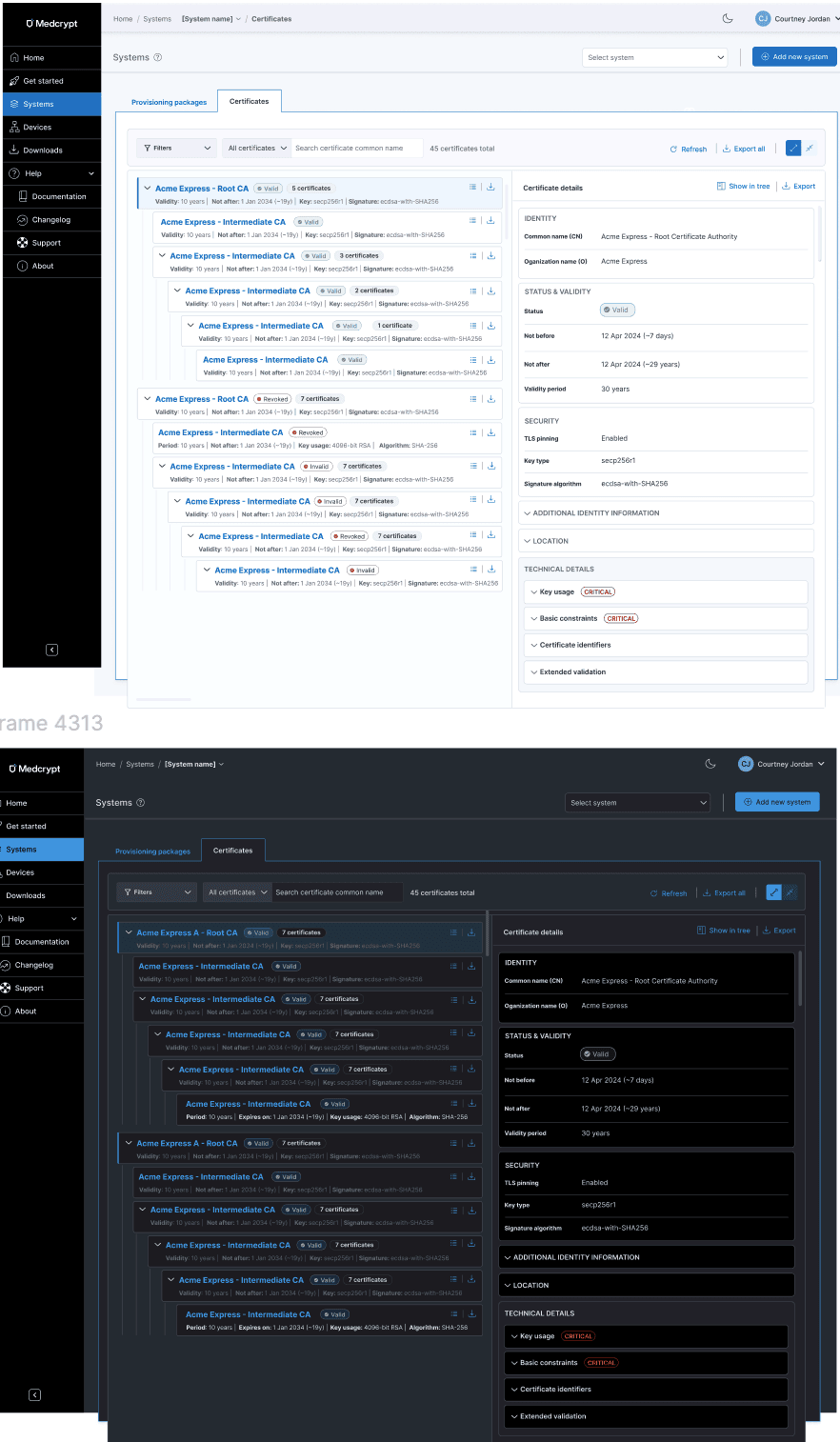
I devised a badge system to show current certificate status, as well as revocation status.

Because revoking one or more certificates on a device was serious, I created confirmation panels for single and bulk certificate revocations.

In addition to creating the UI and help center, I also created the product's first datasheet, helping to solidfy product positioning and value prop for a very technical product. This was essential as our sales and marketing people had deep medical device experience, but didn't know anything about device provisioning and certificate management.

I delivered a complete UI, workflows, and help center in about a week.