Projects
Projects

I design end-to-end product experiences and the UX systems that sustain them — from early foundations through growth, optimization, and scalability.

The company was an early-stage medtech cybersecurity startup, and the product existed as a concept-phase prototype with a small customer base. There was significant urgency to establish an enterprise-ready platform to support medical device manufacturers under emerging FDA cybersecurity expectations.
At the time, the product had no UX foundation. There was no design system, information architecture, or shared mental model for how the platform worked—either internally or for customers.
From a user perspective, the expaerience imposed a high cognitive burden:
The interface shipped exclusively in dark mode, which did not align with enterprise expectations in regulated environments. Contrast and legibility issues further reduced usability, and core interaction patterns—forms, filters, buttons, and status indicators were non-existent.
Additionally, the product’s value and positioning were not yet clear to the market.
With no designers, the initial concept had few customers and its value and positioning were not clear to the market.

Design and deliver a usable, scalable SBOM vulnerability management platform from an early prototype — while the company, product strategy, and internal processes were still forming.
This required:
I designed and built the foundational systems required to take the product from an early prototype to an enterprise-ready platform. I worked end to end across product design, product management, and technical writing, creating structure while the product and organization were still forming.
There were several scenarios, from creating your own to being invited as a user or an admin to an existing account and more. This was previously handled manually, so this included defining expiration limits and next steps.

This enabled users to get started quickly, no matter where they were, brought forward our integrations (which were heretofore undiscoverable) to show how easy it was to integrate into your CI/CD pipeline, pointed you to key topics in the help center to ensure your success, and upsold our services team offerings if you needed extra help. I ideated this Get started hub and wrote all help center content to complement it.
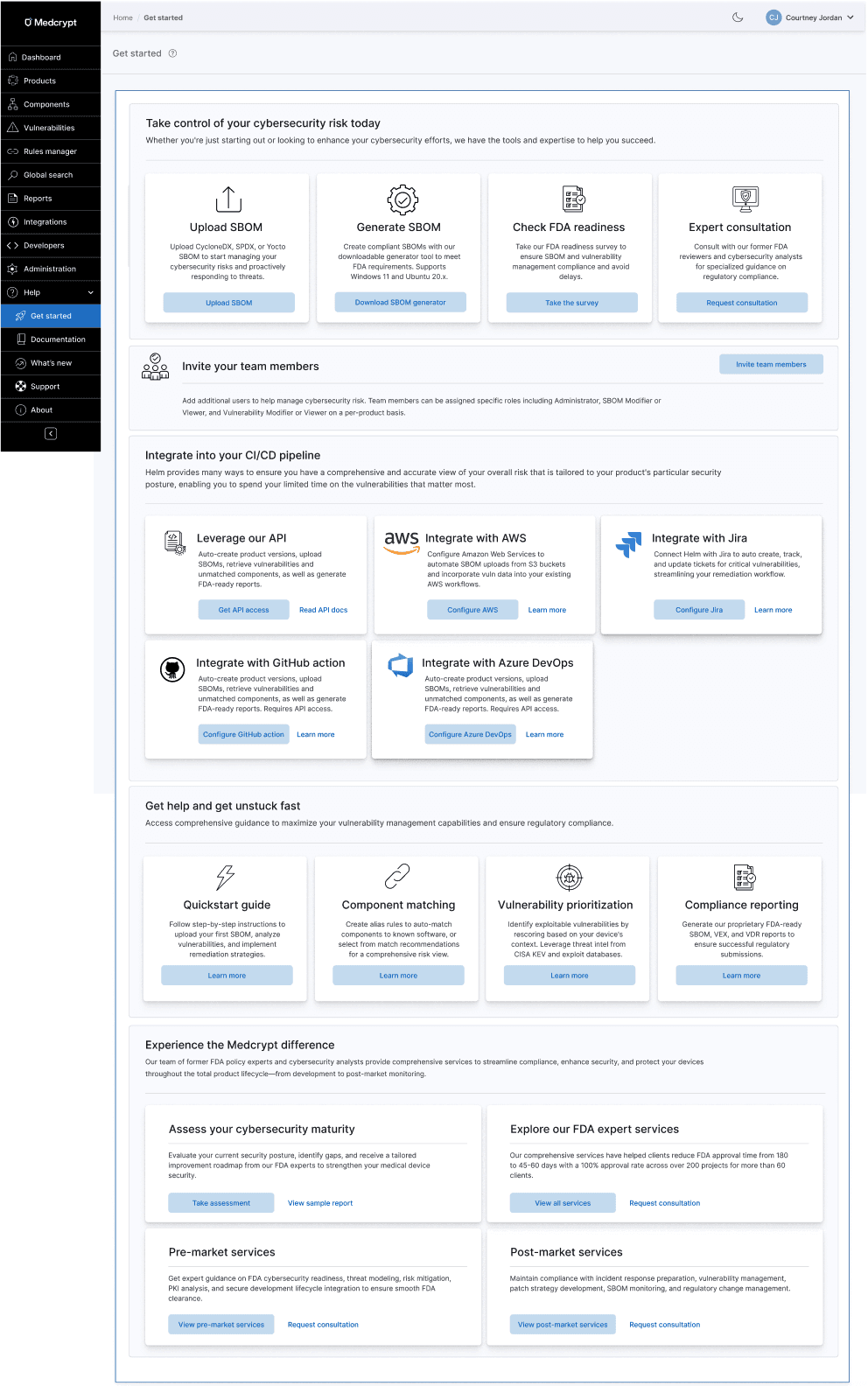
There was no help center for the product, so I created all content (on Gitbook) while designing the product, which can be seen here: https://helm.docs.medcrypt.com/

With the addition of a few integrations and our API, but low usage, I pushed for an Integrations hub to improve discoverability.

As you know, getting users to invite other users to the application is a major factor of stickiness, so this enabled users to invite other users to join one or more workspaces within an organization. This also included determining what the roles would be and how they would fit in to the existing user administration processes.

I created a sidebar with iconography and integrated help.

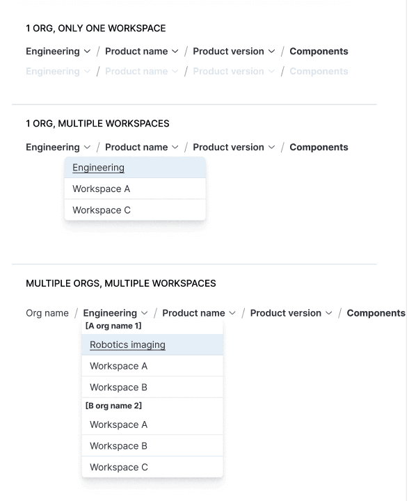
Introduced breadcrumbs and underlying URL structure, mapping out current and future state of the platform. This enabled users to view all available products and versions and quickly switch between them.

I pushed for breadcrumbs and URLs for traceability, mapping out the breadcrumbs and URL structure of current and future state for every use case, setting the product up for traceability to be added in the future.

When customers asked for workspaces much later (including across multiple units within a larger organization) this was a snap to add to the scalable breadcrumb system.
Both components and vulnerabilities had the same main goals, which was to remediate the most exploitable vulnerabilities and have an accurate understanding of your overall risk. From research, we'd found that many companies just wanted vulnerability remediation to be automated so that they didn't have to spend valuable cycles on this. We now had an AI guidance system that collected security advisories and vulnerability information from many sources, so this is integrating that automation to get customers to value quickly.

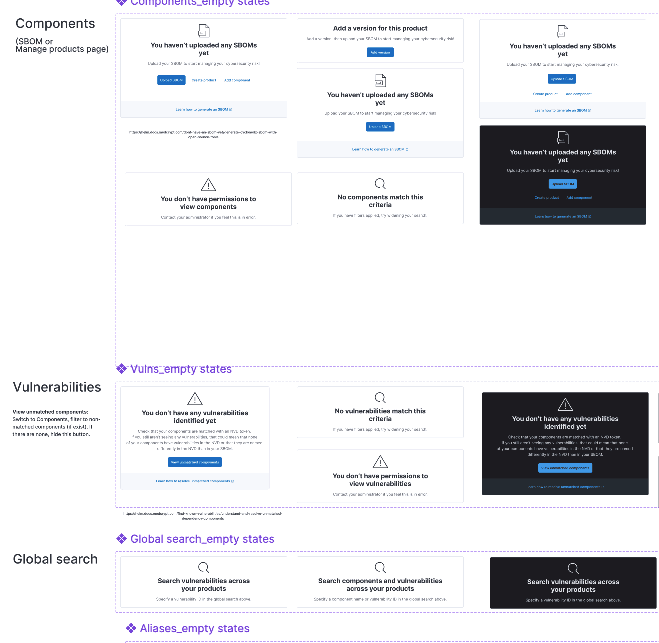
I introduced empty states for each page, making it easy to understand next steps. This also included figuring out all of the permission states, as these weren't clearly defined at this point.
This was a project that I drove myself, identifying all of the categories for FDA metrics and SBOM quality and compliance, as well as what constituent parts made up each category.
This Compliance & quality tab encompasses FDA metrics and SBOM quality, in addition to the new categories I added: fixable and fixed vulnerabilities. The definitions for the FDA metrics were not clearly defined in the industry, thus I had to determine what fell into each category as well as how to calculate FDA metrics (how we could measure them given our current application features, as well as what we would need to add). The overview widgets are from a public design system, but I created the detailed bar charts beneath as well as the color scheme.

This was one of my favorites. From my several years designing the product and telling the story in the documentation, I determined what fell into each category. This shows a high-level exploitability intelligence, then gets into the lower-level risk-management dashboard.

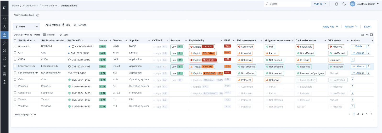
For each table and each dashboard, I determined the categories of filters, as well as what was in each category so that users could quickly drill down on just what they needed.
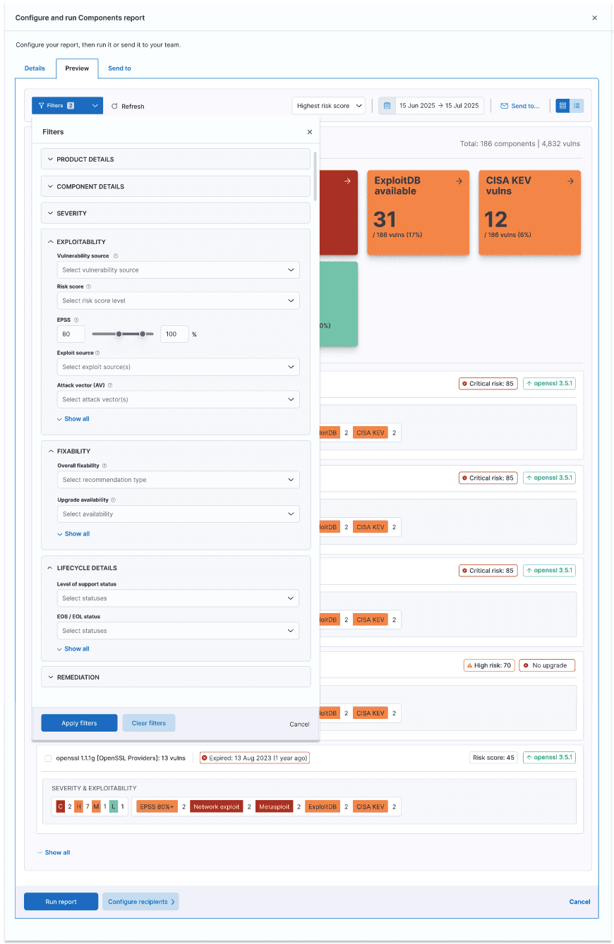

Each table could be customized to exactly what you needed. This included creating all of the badge patterns and definitions, determining logic for next steps.
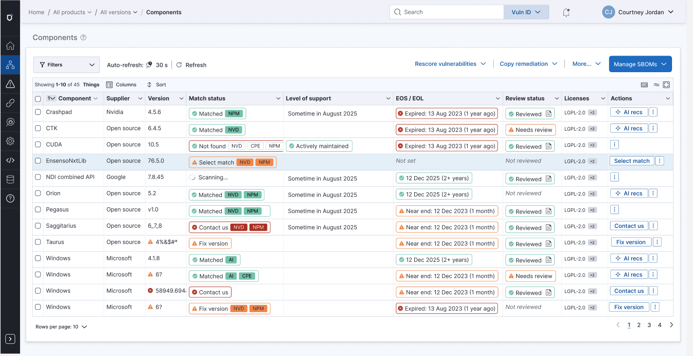
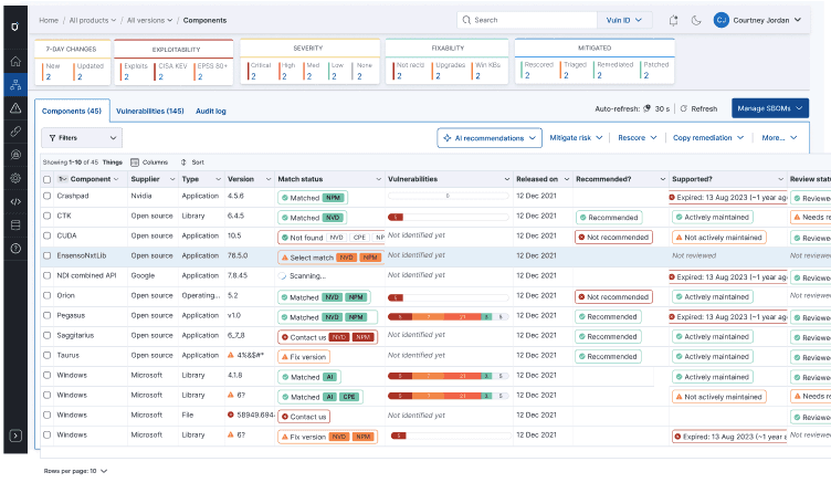
This is something that I ideated to bring forward the current state of components and vulnerabilities. This showed changes over a 7-day change cycle (from conversations with customers, this was important), as well as exploitability, severity, fixability, and current remediation state.
Instead of the user trying to guess what next action they should do, this eliminated all uncertainty.

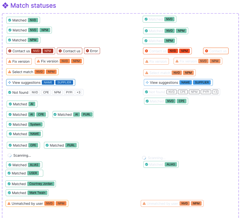
I created a whole badge system to deal with every status, from match to remediation to license risk to lifecycle risk and beyond.
Getting your components matched to known NVD software was critical to identifying the associated vulnerabilities.
This showed what was most important to focus on because it had a CISA KEV, Metasploit, ExploitDB, and other exploitability sources.

I created the first product datasheet, showing how we could position the product, which enabled our sales and services team to better speak to our product's value.

Getting a component to match to a known software component in the NVD or package manager was critical to the next step of viewing vulnerabilities for that component, so I put a lot of emphasis on making sure customers understood this and how to match components that didn't automatically match.
In addition to the badge system that displayed at the table level, shown above, with the suggested next step, users could click in to see exactly what state a component was in and what to do next.

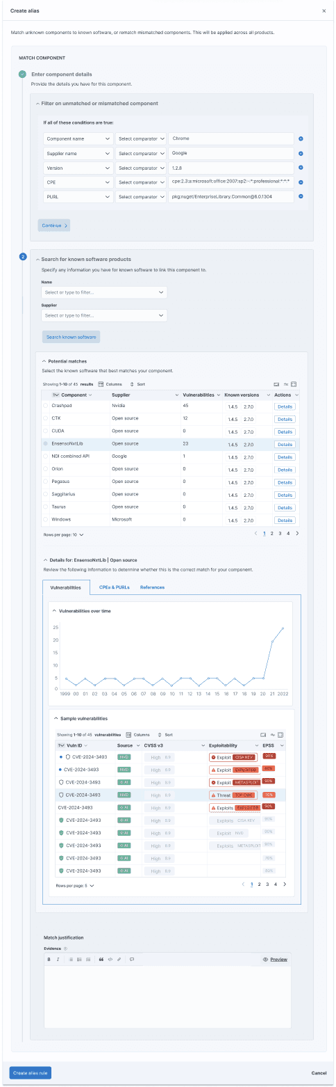
Users could create alias rules to automatically match a hard-to-identify component in existing and future SBOMs, drilling into the details about a possible match to ensure they were selecting the correct one. It is critical to identify components to have an accurate, complete view of risk.
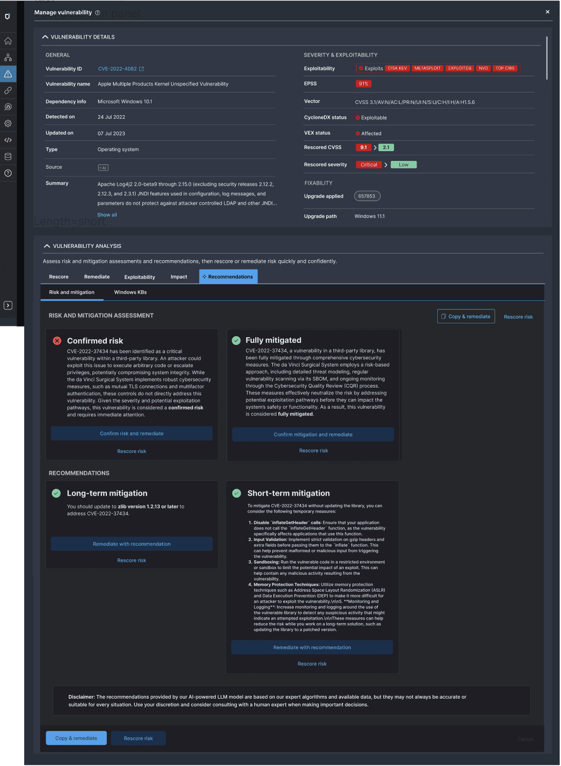
As the product was growing, each action had been tacked on, such that there was no unified view of the vulnerability and associated actions. I pushed for a unified view of each product, vulnerability, and component. Whether it was a vuln or a component, the problem was the same - prioritizing and remediating the most important vulns to make your product safer.
The unified view of each object showed its current state and fixability, as well as available actions, including AI recommendations.

This assessed current risk against mitigation, assessing what still needed to be done, and providing AI recommendations for short and long-term mitigation, which could be shared with an R&D team for prioritization. I also wrote all documentation, including how we could position our nascent AI: https://helm.docs.medcrypt.com/manage-vulnerabilities/leverage-ai-powered-vulnerability-guidance
The product evolved from an early prototype into a cohesive, enterprise-grade platform.
Users were able to self-serve through onboarding flows, empty states, dashboards, and integrated help, reducing reliance on support and tribal knowledge. Cognitive load was reduced by clearly surfacing system state and next steps, improving clarity, adoption, and internal alignment.
The platform established a durable foundation for FDA metrics, compliance reporting, and continued product growth. Customers can now understand risk, prioritize remediation, and manage SBOM quality with confidence.