Projects
Projects

I design end-to-end product experiences and the UX systems that sustain them — from early foundations through growth, optimization, and scalability.
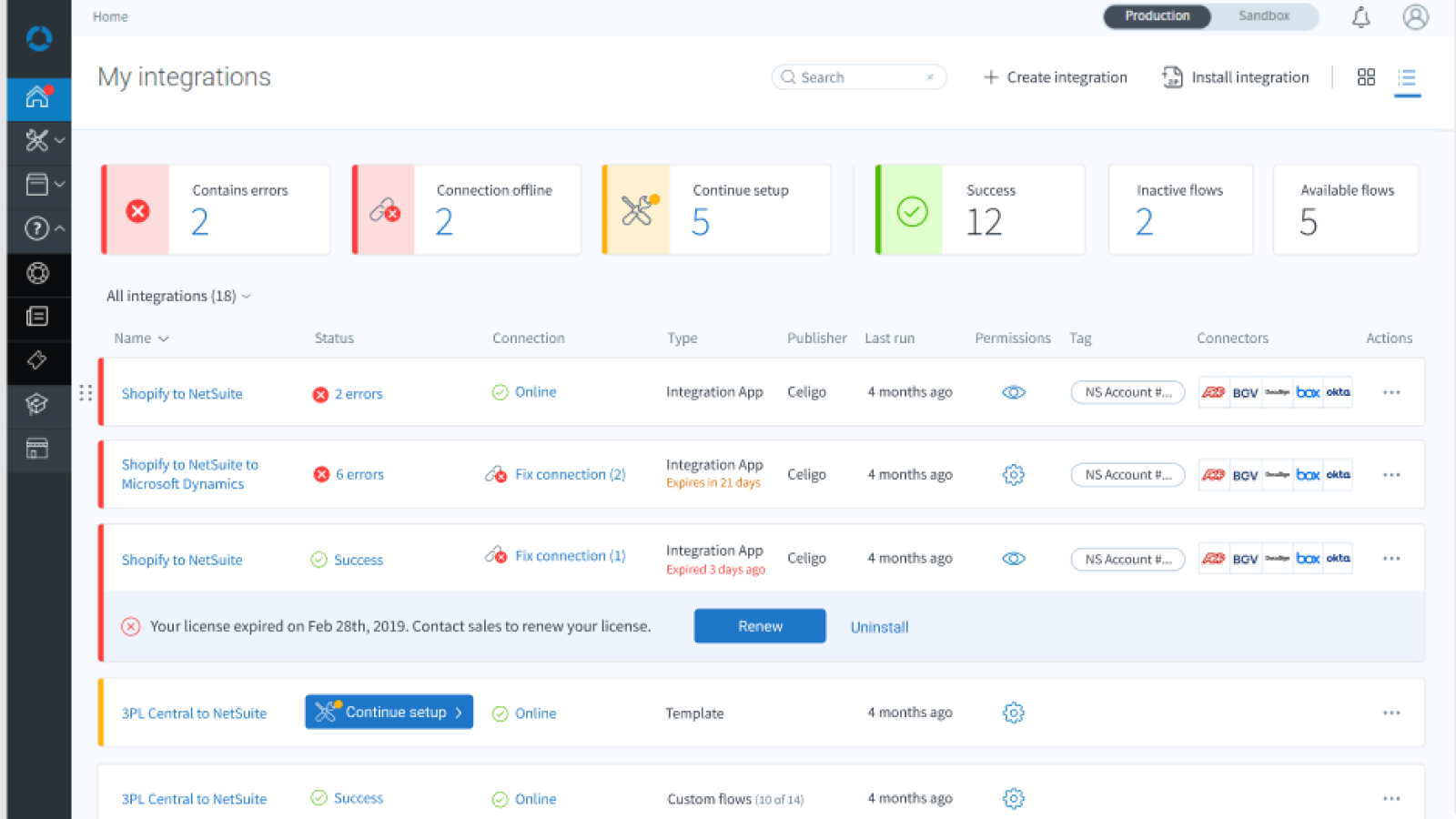
Users couldn’t easily tell what their subscription included or how much of their allocation they had used. Only account owners could view subscription details, and there was no centralized dashboard to show flow status, usage, or upcoming expirations.
At a growing SaaS startup, leadership initially believed that visibility into subscription and usage data wasn’t necessary—users would simply contact support or sales when they ran into limits. This created avoidable friction, reduced engagement, and slowed expansion opportunities. All processes of renewal and upgrade were manual, enabling users to continue getting free access long after their trial or paid subscription had expired.
To align stakeholders, I demonstrated how visibility drives engagement and reduces churn. By surfacing real-time subscription and usage data directly in the product, users could manage limits without contacting support—turning a hidden process into a value moment.
This included a home dashboard for flow status and usage, as well as in-depth subscription information on current usage and availability, prompting faster conversions, renewals, as well as more new flows being created and broken flows being fixed.
The new dashboard kept you up to speed on everything that needed your attention, whether to fix, finish, or check the success of. Users could quickly follow up on inactive flows and always knew when they could create new flows or it was time for an upgrade.

Not only did the dashboard prompt more flow usage and quicker error recovery, it also speeded renewals and decreased downtime.
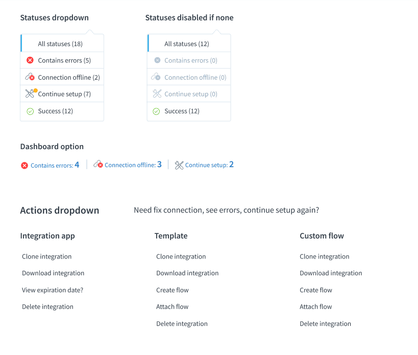
This shows the breakdown to determine statuses and available actions for different types of flows.
Users could tell right away what was available on the free plan, speeding conversion.

Initially, ending trials was a manual process, where non-converting users would continue to use the system.
Loss aversion
Leveraging the principle of loss aversion, users could clearly see the value they’d lose as their trial ended—motivating earlier upgrades.
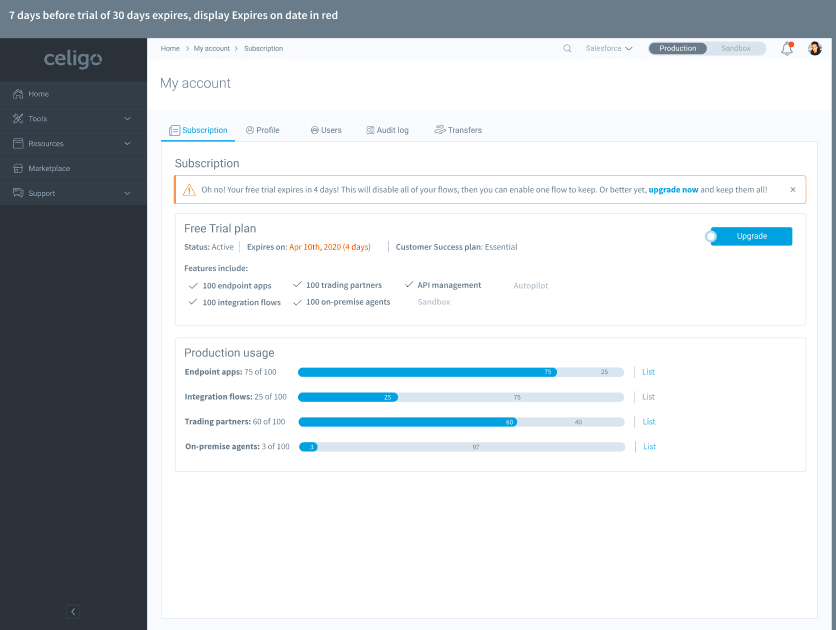
For enterprise accounts, visibility across sandbox and production environments encouraged testing and deployment, aligning with the company’s North Star metric: increasing the number of production flows.

Drill down for more information
Users could drill down into each category, as well as quickly see where something was used, such as a flow in an integration (which could have multiple flows) or an endpoint app used in a flow within an integration.

Although quantitative metrics weren’t tracked at launch, internal adoption and qualitative feedback showed clear outcomes:
Transparency builds trust. By making subscription data visible and actionable, the dashboard not only empowered users but also created natural engagement loops that fueled product-led growth. What started as a small usability enhancement became a foundation for customer expansion