Projects
Projects

I design end-to-end product experiences and the UX systems that sustain them — from early foundations through growth, optimization, and scalability.
Axway was a mid-size international corporation that was growing quickly and would eventually become a Gartner Magic Quadrant leader. They had a vast product porfolio at the time and had been acquiring rapidly.
Axway's flagship product, B2Bi, was used by enterprises to manage complex partner integrations, message exchanges, and opeational workfllows. At the time, this product was responsible for the lion's share of the incoming revenue for the company, but had never had a designer and had grown organically over a decade, so workflows were fragmented, next steps unclear, and cognitive burden was very high, both for team members and customers alike.
B2Bi presented several interconnected problems:
Users could accomplish what they needed — but only with deep expertise and significant effort.
Given the complexity of the legacy codebase, I focused on architectural changes that would have minimal development impact while delivering meaningful usability gains.
I restructured navigation by moving entire pages and modules rather than breaking functionality apart, balancing an improved mental model with technical feasibility.
I initiated a customer collaborative design program to understand how enterprise users actually managed their integrations.
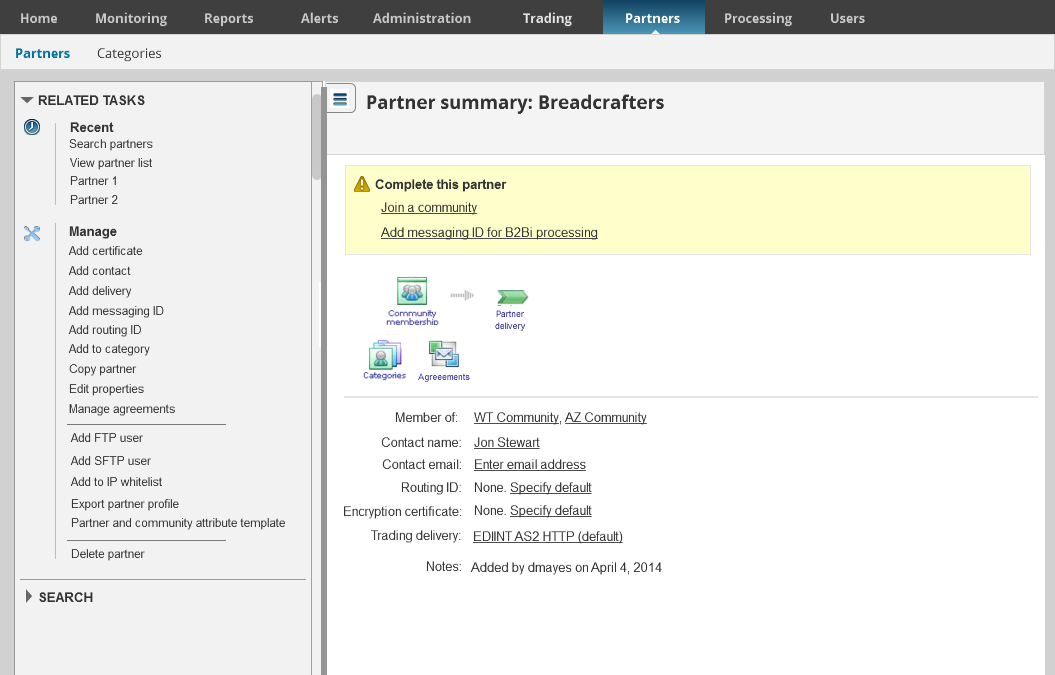
Through interviews and usability testing, I identified a critical issue: customers often had hundreds of tasks with no way to categorize, ignore, or remove them, creating clutter and obscuring what mattered most.
Based on research insights, I introduced:
This reduced visual noise while keeping critical information accessible.
I explored multiple layout models, including right-side, left-side, and dual-sidebar approaches. Through testing, a left-hand collapsible sidebar proved most effective for:
Prototypes were validated with both customers and internal stakeholders before implementation.
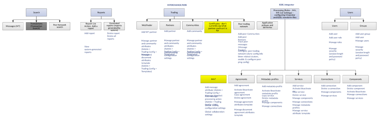
I re-architected the product such that it had a minimal impact on development, moving whole pages instead of breaking them up. This was a design compromise to improve the overall experience. I diagrammed out each area, its pages, and identified the tasks to make next steps clear and streamline flow creation, troubleshooting, performance visibility, reducing cognitive load.
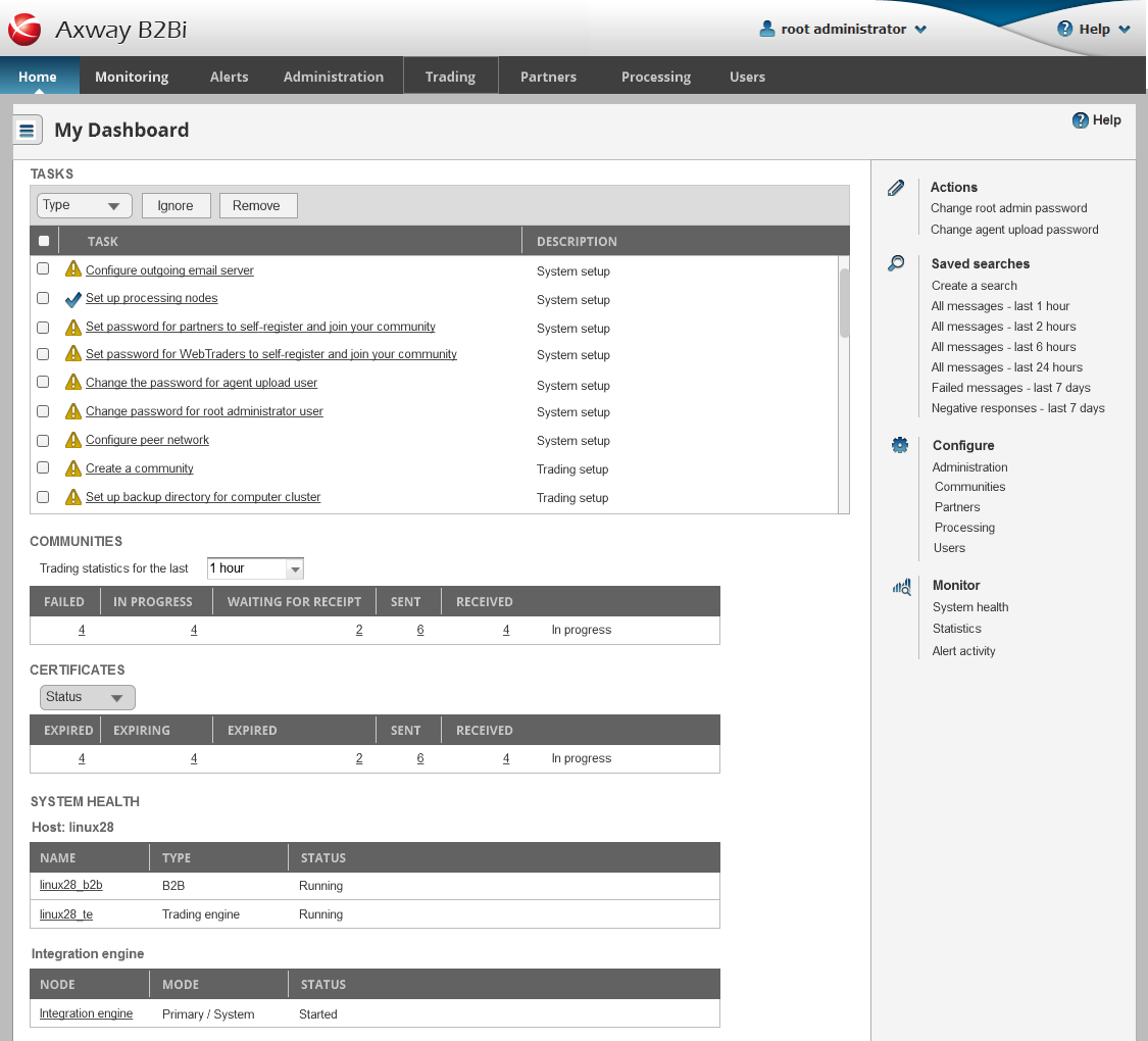
Customer research revealed many ways to improve the experience, such as categorizing and removing errors. For example, there was no way to categorize or remove tasks. Customers had hundreds of tasks that they were stuck with on their dashboard. We categorized tasks and added the ability to ignore and remove tasks. We also built a collapsible sidebar for information that needed to be accessed less frequently, while collecting the most relevant actions, recent searches, and other related areas.
Iterative design - earlier concept
I tried both right and left sidebar and even two sidebars. Right sidebar emphasized content, but left sidebar worked best with show/hide menu icon.
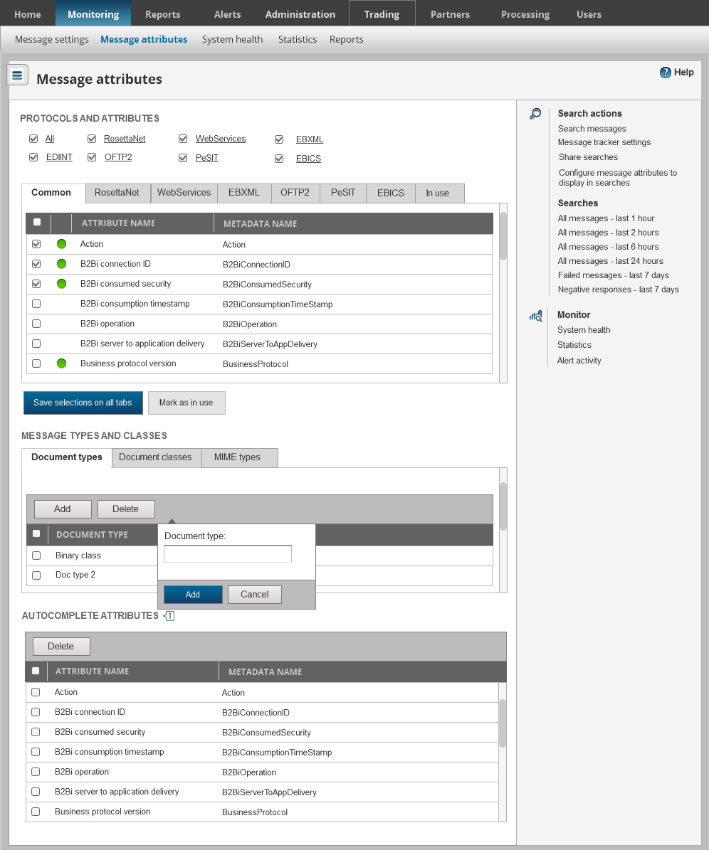
The collapsible right sidebar enabled customers to understand available actions, as well as to access recently viewed pages and search results. The next step was to redesign the flow builder itself, but I left the company before this happened.
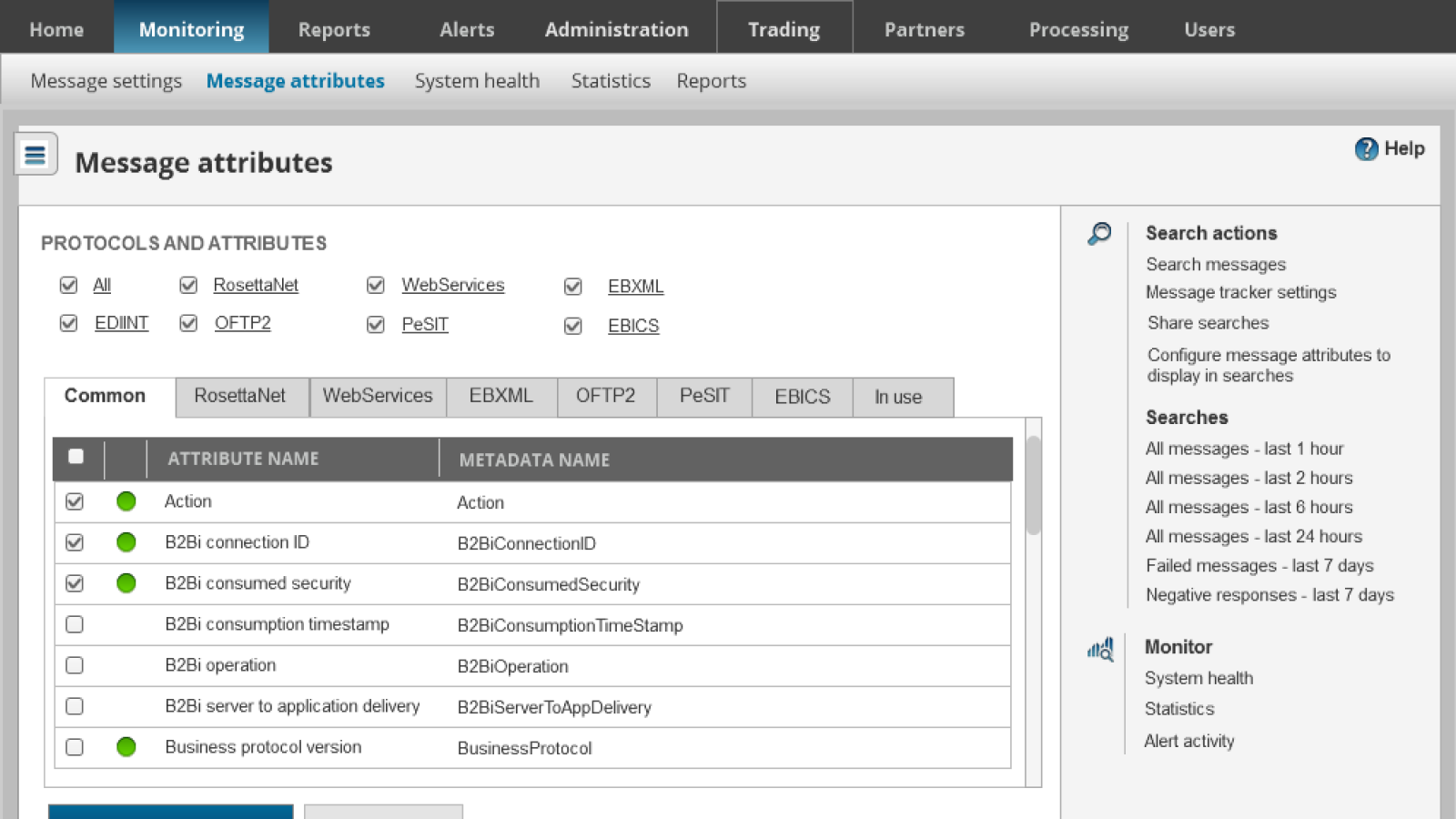
Locating information in the product before this redesign was difficult. This search hub enabled users to quickly access searches in particular timeframes, as well as to perform advanced custom searches.
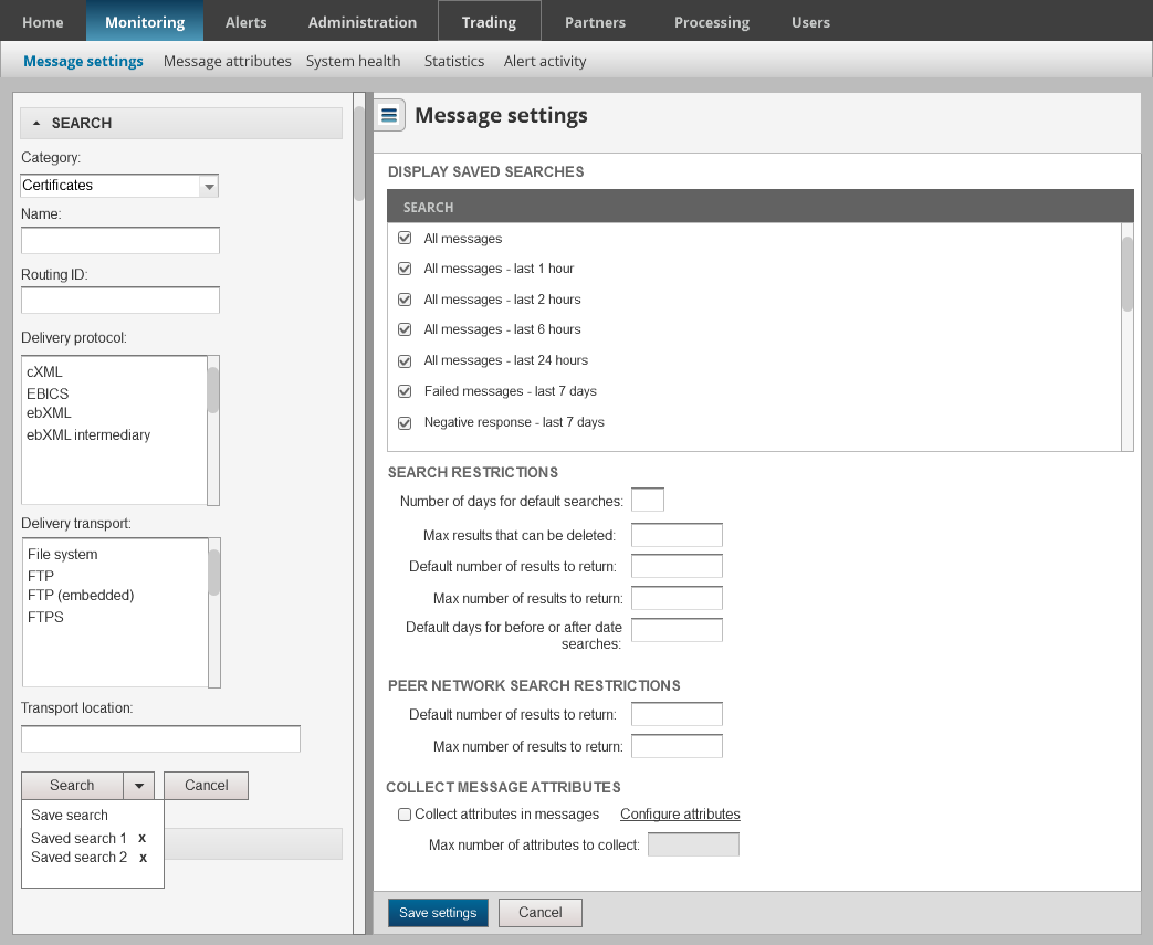
I left the company before this was fully implemented.