Projects
Projects

I design end-to-end product experiences and the UX systems that sustain them — from early foundations through growth, optimization, and scalability.
Axway was a mid-size international corporation that was growing quickly and would eventually become a Gartner Magic Quadrant leader. They had a vast product porfolio at the time and had been acquiring rapidly.
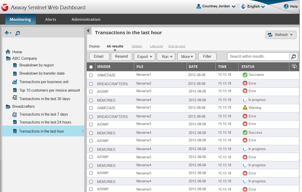
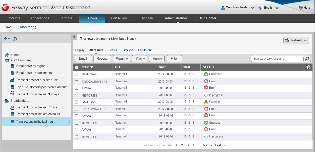
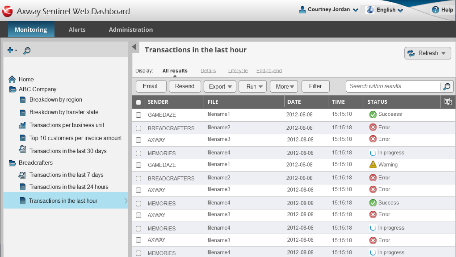
Axway's flagship product, B2Bi, was used by enterprises to manage complex partner integrations, message exchanges, and opeational workfllows. At the time, this product was responsible for the lion's share of the incoming revenue for the company, but had never had a designer and had grown organically over a decade, so workflows were fragmented, next steps unclear, and cognitive burden was very high, both for team members and customers alike.
The licensed analytics product created serious friction for both customers and internal teams:
Rather than attempting surface-level UI fixes, I initiated a full information architecture review to identify structural issues driving usability problems. To minimize development risk, I redesigned the architecture by moving entire pages and modules, rather than breaking them into smaller components that would require extensive refactoring.
This allowed meaningful improvements while respecting legacy code constraints.
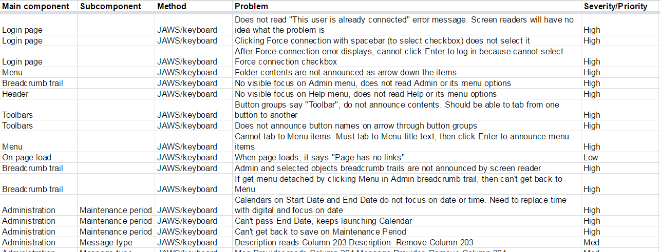
Accessibility was not treated as a checklist item. I conducted comprehensive accessibility testing and documented over 300 accessibility issues across 51 categories, including:
I tested designs using JAWS and created a formal VPAT (Voluntary Product Accessibility Template) to document compliance gaps and guide remediation.
Analytics dashboards suffered from fundamental design flaws:
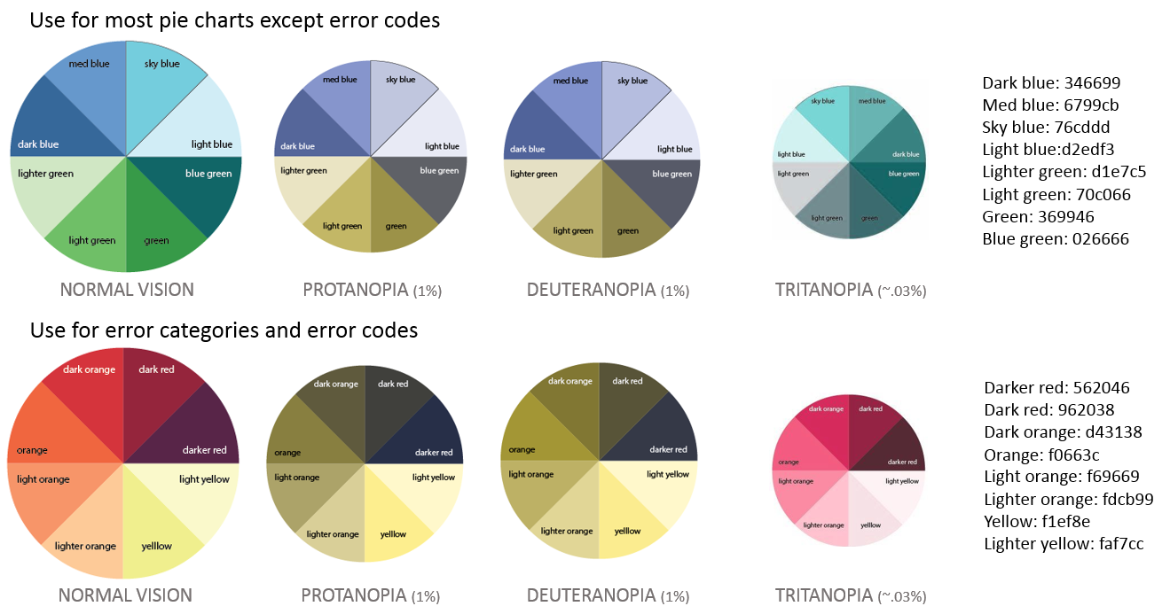
I redesigned chart systems and created color-blind–safe palettes supporting Protanopia, Deuteranopia, and Tritanopia.
These improvements benefited all users, not just those with color vision deficiencies.
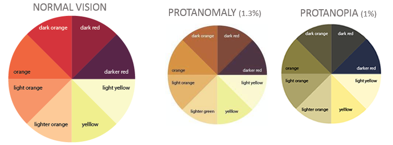
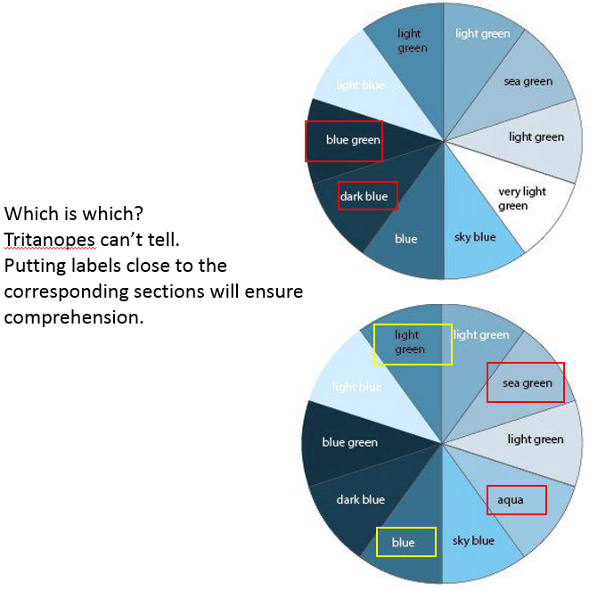
I created palettes that would work for Protonopia, Deuteronopia, and Tritanopia. This covered both red-green and blue color blindness.
To ensure changes reflected real workflows, I initiated a customer collaborative design program, involving:
This surfaced major pain points, such as the inability to categorize, remove, or manage large volumes of monitoring tasks — an issue affecting nearly every customer.
I redesigned Sentinel to work both as:
This included aligning branding, navigation patterns, and interaction models so analytics felt like a cohesive part of the overall experience rather than a bolted-on tool.