Projects
Projects

I design end-to-end product experiences and the UX systems that sustain them — from early foundations through growth, optimization, and scalability.
Axway’s support site had become bloated and inconsistent after years of acquisitions.
Documentation varied widely across product lines, filters listed outdated operating systems, and many categories were never validated with users. There was no global search, no analytics, and the site wasn’t responsive—users couldn’t self-serve on mobile devices.
Worse, the European support team resisted UX involvement, fearing disruption to established workflows. Building trust and demonstrating data-driven value were essential to move forward.
I initiated the redesign as part of Axway’s customer-journey optimization effort, emphasizing that support was a key touchpoint in retention and trust.

As any good usability engineer designing a new system, I flowed out all possible user actions…
In the Documentation area, users can access documentation for each of their products, see how recently they were updated, and favorite docs.
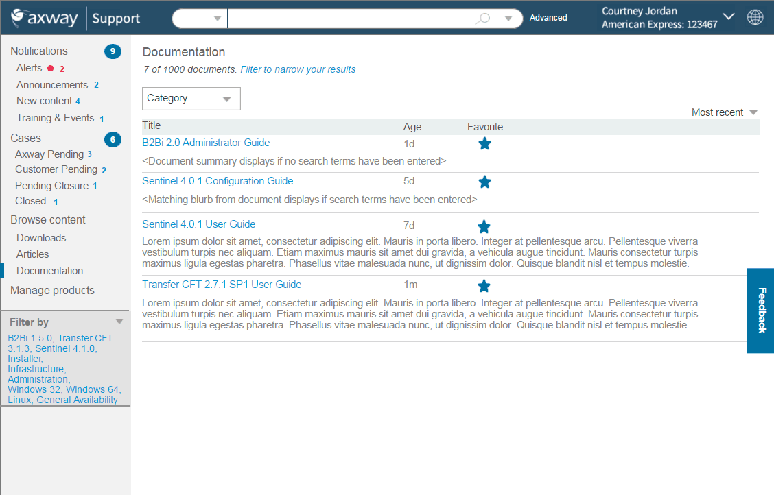
Bring information forward: Users could quickly tell what needed their attention, what filters were applied, perform global search by product, then narrow down by category, understand document age, favorite items to find them again quickly. This rebranded site ensured that customers understood that this site was part of the Axway ecosystem.
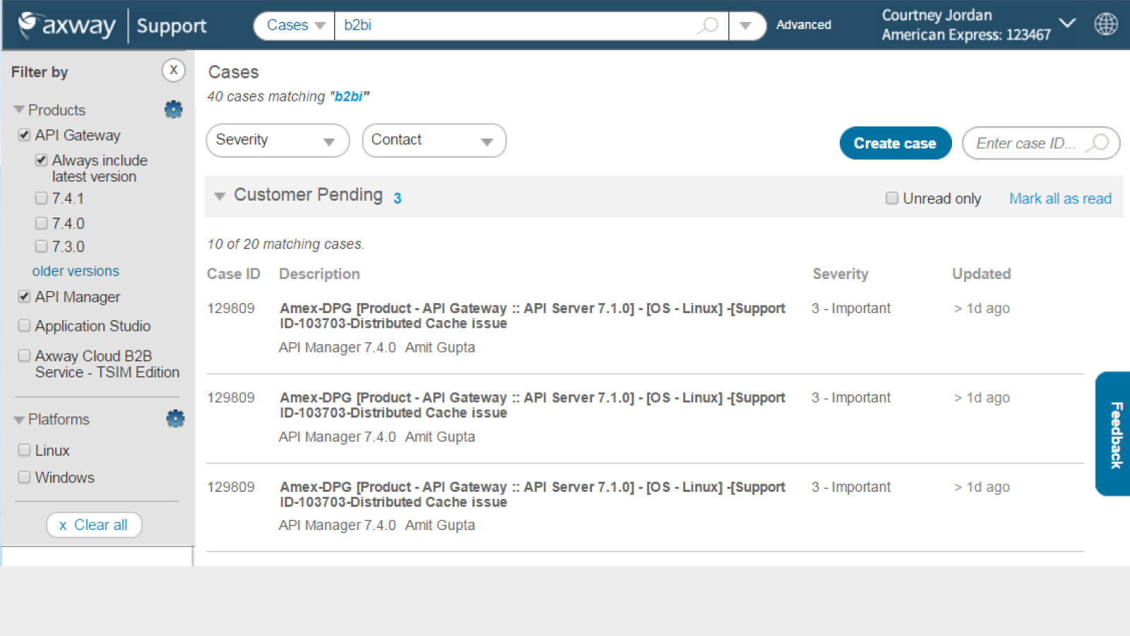
In the Cases area, users can filter cases by particular products, severity, and support agent. They can see each case's severity and when it was last updated. They can also view only unread updates or can mark all as read. An improvement to this would be bringing forth a summary of each update.
Prior to this improvement, customers had to call their support rep to get case status, greatly impacting turn-around and resolution time.
This was the first mobile anything for Axway. It aligned with users' goals because when someone is trying to fix a problem, they are generally on their mobile phones and expect to be able to search for it, as well as to get notifications such as case updates while they are on-the-go.

Getting things down to the bare essentials. I recruited unpaid users and support agents to inform the new design, and particularly what was most important for mobile.
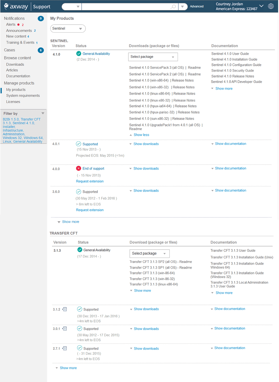
This My Products hub was the first time users had ever had one place to download and access documentation. They could immediately see what was supported, what was EOS/EOL, helping them to determine when they needed to upgrade to a newer version.
There were pages of outdated and even unused OS filters. I researched the new names for all of the OSs, went through all content and identified which to remove and what the updated OS names should be. This aligned with users' mental model when trying to find product documentation pertaining to a particular OS.
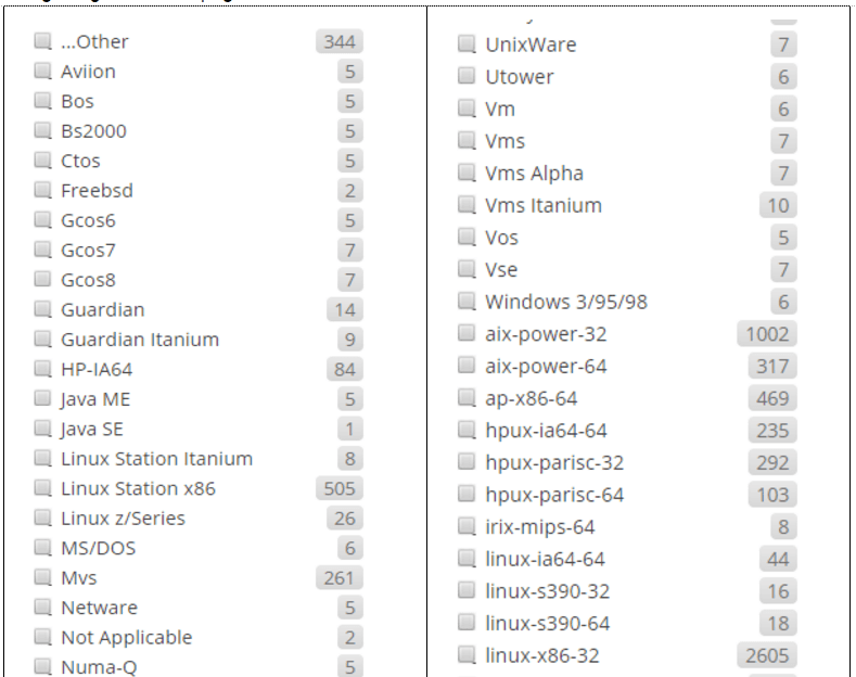
Many of these operating systems no longer existed or had been acquired.

In the pre-AI days, figuring out the new operating system name was a challenge!

Weeding down the filters: Which still had relevant content and how recently had it been updated?
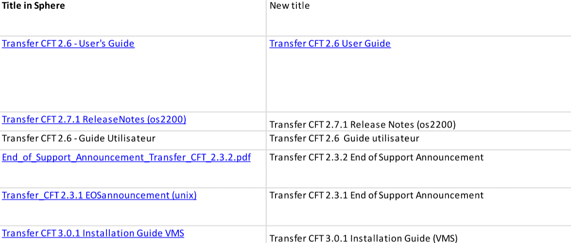
Bringing clarity from chaos: Axway had had so many acquisitions of companies and products, so docs had all different titles even if they had relatively the same type of information. To top it all off, some docs were also in French and German, so I needed to align that into a common set of filters.