Building integration platform from ground up

Growing a startup to Gartner MQ Leader

I design end-to-end product experiences and the UX systems that sustain them — from early foundations through growth, optimization, and scalability.

Initial company and product state

Company state

Celigo was a Series A SaaS startup, and I was the first product designer. The platform’s success depended on enabling customers to build and maintain complex data integrations independently, without relying on professional services. Its current Gartner position was Niche, though it would move to Leader.

Product state

Flow creation was the core of the product’s value, but it relied on a series of complex forms to connect data. The flow builder itself was in alpha state, but needed to become the core way users built and evolved flows.

Challenge

Celigo’s early platform hid everything inside an app dropdown with no sidebar, no onboarding, and no concept of where you were in the product. Users couldn’t see flow status, error history, or even how many flows existed; only determined developers could succeed. Time-to-value was extremely high and confusion was the norm. One developer I tested described it as being stuck in a black box, with no map to navigate. Business users — a major growth audience — couldn’t get started at all.

Additional constraints made the problem harder:

  • No design tooling budget
  • No research budget
  • Sole designer in an engineering-run company
  • No visual language, no information architecture, no design principles
  • No error visibility, no debugging, no mapping clarity
  • No ability to preview data, test configurations, or replace connections
  • Zero onboarding, blank states everywhere

The platform’s UX was a direct blocker to product adoption, enterprise growth, and trial conversion.

Old design

The old design had no navigation, didn't bring forth errors, hid available actions. It had low adoption and conversion, and even developers found it difficult to use.

There was no way to test flows, see output, understand errors, and troubleshooting was difficult. There also was no visibility of how the application's navigation was structured, and no way to get out of a process once started, let alone picking it up later. This didn't align with the fact that that different personas were involved in different steps, so wouldn't be working on it at the same time, and needed to be able to hand-off to a developer, for example.


Complicated forms kept technical and business users alike from building flows

Approach

I designed and architected the entire platform experience from the ground up — as a team of one — and gradually built the foundation for what later became an international UX organization.

Establishing UX strategy, trust, and foundations

  • Built trust with engineering leadership by delivering early wins: reduced visual weight, clarified hierarchy, and introduced task-first workflows.
  • Set up user understanding by partnering with Services, Support, and Office Hours to hear user pain points and observe workflows.
  • Conducted competitive analysis and internal/external usability sessions.
  • Created the visual language, information architecture, breadcrumb and wayfinding model, platform status tracking, and design review processes.
  • Introduced design reviews, usability testing, and async design workflows

Redesigning the platform navigation and mental model

  • Replaced the app dropdown with a clear sidebar and breadcrumb system so users always knew where they were.
  • Restructured the platform around the true primary task: building and managing flows.
  • Reduced visual noise and unnecessary chrome to directly reduce cognitive load.
  • Exposed previously hidden actions (settings, dashboards) with accessible controls.
  • Introduced a sidebar and breadcrumb system so users always knew where they were, as well as an underlying URL structure for introducing traceability. Previously, the application was "modals on modals", with no ability to track usage or actions.
  • Initially all flows were created via forms with no visual canvas, while the flow builder, which would become central, was just in its infancy.
  • Redesigned flow builder, introduced robust error resolution console, ability to modify and test the flow, nested data mapping, and more.

Homepage

The new homepage showed which connections were broken, where you'd left off, number of errors, number of flows in an integration. It also made getting started easy, as most users were looking to create flows, and didn't understand what connections are integrations were at this point.

Dashboard

Even with the initial redesign, companies with many integrations had a hard time with the tile flow, so I pushed for a list view with dashboard, which brought a lot more information forward on what needed attention, what was available for additional integrations, and aligning with what would become the company North Star, getting people to create more flows.

Empty states to get started quickly

Onboarding tours

We added onboarding and guided tours at every point in the flow creation journey.

Getting users started and unstuck

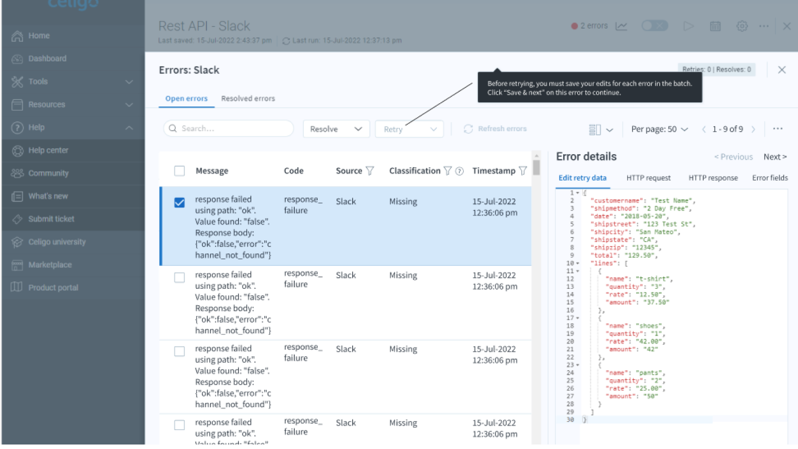
This error management tour reduced the complexity of the most important thing, getting flows working and sending data, which meant making sure all errors were resolved quickly.


Fixing flow creation and cognitive friction

Creating flows was critical to retention and stickiness. Later, it would become the company's North Star. Optimizing the process of building, evolving, and managing flows was the core focus.

  • Removed the forced “stop everything and create a connection” step that impacted success.
  • Enabled users to map out flows before configuring authentication — a major unlock for business users who couldn’t set up connections.
  • Introduced preview data, configuration testing, and early validation to prevent hours of trial-and-error debugging.
  • Added branching logic after user research revealed customers were misusing filters to simulate branches.
  • Brought forward information on what was and wasn't configured, as well as reducing complexity by only showing a plus icon rather than the plethora of options you could pick from.
  • Larger flows could get more complex and hard to understand the breadth of, thus added mapping, zoom in/out, full screen controls.
  • Added Run console, enabling users to see what was running, what had run, what connections were used and whether they were set up correctly, with less frequent options in the More drop-down.

Visual flow builder

The new flow builder canvas reduced complexity. Previously all controls were shown at once, overwhelming users, especially business ones, and it was impossible to see what was working and what wasn't, or where you or a team member had left off in building a flow. Despite experimenting with rectangular nodes, the flow builder node shapes were something that the executive team wanted to keep, even though it did make building flows, bringing forth information, and understanding what needed attention more difficult.


Modifying flows

Initially, you couldn't modify flows at all once built. That included what applications were used to send data. If you switched to another application, such as Shopify to Amazon, you had to create the flow from scratch. Adding this ability paved the way for copying flows and modifying them, greatly reducing manual effort and time to get flows up and running.

Adding ability to branch and evolve flows

The new flow brancher enabled flows to evolve and expand with changing business needs. Prior to this, flows were not very adaptable and flow complexity wass limited. This came about from learning how customers were using filtering to create flow branching. Adding branching was critical to customer need platform evolution.

The new flow brancher enabled you to add branches and remove branches with ease, enabling companies to create much more complex flows and to adapt them quickly to meet evolving business needs.


Mapping complex data between flows

The new flow mapper let users align their data field mapping with the actual structure of their JSON, rather than trying to map flat data structures.

  • Brought forward data type, lock status, lookup settings, and mapping metadata.
  • Added side-by-side input/output previews to make mapping understandable.
  • Evolved mapping to reflect nested JSON structures rather than forcing users into flat field mapping with dot notation and indexes, which added yet another layer of cognitive burden.


Error management overhaul

Initially there was no information about errors, error messages were truncated, you could only resolve one issue at a time. The CTO and a customer said that these error management improvements revolutionized the platform.

  • Eliminated 100% of context switching by enabling users to step through errors within the flow itself.
  • Added batching, retry handling, relationship visibility, and detailed error context.
  • Made it possible to resolve complex, chained errors in minutes, not hours or even days.

The error resolution console continued to evolve, including adding the ability to batch process resolved errors. Users could see at a glance how to resolve errors. This was aided by a troubleshooting guide we created in our help center.

Impact

  • Transformed Celigo from Gartner MQ Niche to the Leaders quadrant.
  • Reduced flow creation time drastically
  • Reduced error-resolution time from half a day to minutes — praised by customers and internal teams.
  • Reduced cognitive load dramatically, enabling LOB users to build flows, not just developers.
  • 100% reduction in context switching for error management.
  • Significant acceleration in time-to-first-value, leading to better trial conversion and adoption.
  • Became the foundation for the international UX team, processes, and design culture that exists today.
  • Provided a unified, scalable UX that enabled the platform’s enterprise growth years later.