I design end-to-end product experiences and the UX systems that sustain them — from early foundations through growth, optimization, and scalability.
Challenges
No prior data or tracking in place — had to design metrics, surveys, and instrumentation from scratch
None of this data existed, so needed to do everything, including launching surveys, determining how to measure self-service score, adding JS to track ticket deflection rate, working with devs to extract error messages, initiating and implementing onboarding, setting up analytics to measure onboarding, and much more.
Tight release cycles: designing ~50% of all features per month while leading UX and content teams
Required cross-functional collaboration with engineering, support, and analytics
At a tech startup, I was designing at least half of all features on a monthly release cadence, so I did not have much time to dedicate to this.
Approach
To demonstrate measurable UX impact, I built two interlinked scorecards — one tracking user experience quality, the other quantifying self-service efficiency and savings. Together, they told a full story of customer journey improvements from onboarding to support resolution. They also showed the combined impact towards improving the user experience of both of my teams: UX/Design and content strategy.
Objectives
Benchmark the current UX and self-service experience to track measurable improvements
Secure executive buy-in to expand research and team capacity
Quantify business impact of design decisions across usability and support
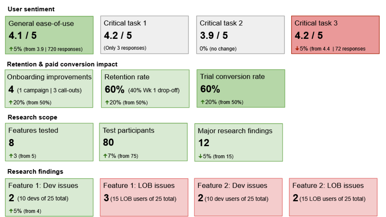
Measuring the customer journey user experience
In order to set the to-be state, I had to understand the as-is state. These are the items I focused on:
User sentiment: ease of use for critical tasks like flow creation and error management
Onboarding impact: tracked retention and conversion during 30-day trials
Research scope: built a structured research program where none existed. When I started, all research was done ad-hoc with customers I cultivated that were willing to donate their time, as there was no budget. Today, there is a a dedicated research budget thanks to these efforts.
Research findings across main personas of developer/IT admin and LOB (line of business) users for particular features and critical tasks. These critical tasks were creating flows and managing errors, the two core functions users needed to do on the data integration platform.
Persona insights: mapped differences in experience between developer/IT and LOB users
Executive presentation: visualized results using green/red indicators to highlight high-impact wins and problem areas
User sentiment: This included general ease-of-use, as well as those for critical tasks.
User experience measurement scorecard
Note that green and red in these scorecards are used as a visual indicator of what I wanted to emphasize and call attention to during an executive business review. Shades of green and red could also be used to indicate degree of positive or negative impact.
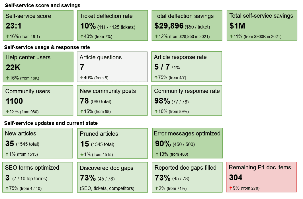
Measuring self-service
In order to set the to-be state, I had to understand the as-is state. These are the items I focused on:
Self-service score & savings: introduced metric combining article views, deflected tickets, and engaged community answers — multiplied by cost per ticket ($50) to quantify savings. Reported on running total saved from both self-service and ticket deflections.
Ticket deflections were initially counted whenever a user went to create a support ticket, but then clicked an article or community post suggestion, but after building an engaged self-service community, I included community responses to customer questions in this rate, to give a more accurate representation of support savings.
Usage & response rate: This included total number of Help center and community users, the number of article questions and community posts, and the rate of response, either internally or externally.
Content lifecycle: This included new articles that were added, outdated articles that were pruned, error messages that were optimized for quicker troubleshooting, SEO terms that were optimized, doc gaps reported internally or externally, doc gaps discovered during SEO, ticket analysis, competitor analysis, or other research. Because the highest priority doc backlog kept growing, this gained support for scaling the team.
Data-driven prioritization: SEO and ticket analysis revealed doc gaps that justified hiring and automation investments
Self-service measurement scorecard
Self-service scorecard
Impact
Created a repeatable measurement system connecting UX research, onboarding data, and support analytics
Earned executive trust and budget for UX research and content scaling
Established a continuous improvement loop—from design to documentation to community engagement
Reduced support costs while improving user satisfaction and retention