Projects
Projects

I design end-to-end product experiences and the UX systems that sustain them — from early foundations through growth, optimization, and scalability.

MedCrypt was a Series B healthcare cybersecurity company known primarily for its services and advisory work. While the company had deep domain expertise in medical device security and regulatory compliance, it did not yet have a mature product organization, a design team, or an established design system.
The product initiative was effectively greenfield. There was no cohesive UI, no shared component library, and no established interaction patterns. Early product concepts relied heavily on dense forms and ad-hoc screens, with high cognitive load and little consistency across workflows. Accessibility, theming, and scalability had not yet been addressed.
MedCrypt needed to rapidly evolve from a services-led company into a product-driven SaaS organization—without sacrificing trust, usability, or regulatory expectations.
Key challenges included:
As the first designer, I needed to define not just screens, but the rules, patterns, and structure that would enable the product to scale.
I designed MedCrypt’s first design system alongside the product’s earliest features, focusing on durability, clarity, and extensibility rather than surface-level polish.
My approach included:
Rather than retrofitting a design system onto finished UIs, I built MedCrypt’s design system ahead of full product maturity, allowing it to shape product direction instead of reacting to it.
This ensured that emerging products shared a consistent interaction model from day one.
I established foundational standards for:
Accessibility and clarity were treated as non-negotiable product requirements, not polish.
I documented the design system in a way that engineers could directly implement, reducing ambiguity and QA cycles.
The system also became a shared language across:
This alignment was critical in a domain where UX decisions can carry regulatory implications.
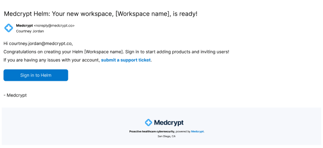
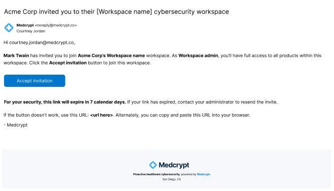
I created new onboarding emails that aligned with security expectations and provided for the future ability to invite users.
I was asked to create a ChatGPT-like interface, so I also identified all product features, which updated, helping to drive adoption and engagement.
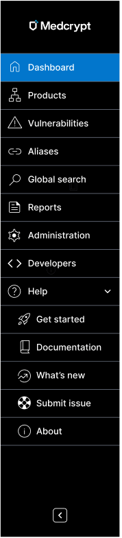
I created the current and expected future state of the sidebar, including adding Help for the first time, helping to build trust.
I created empty states to get people started and to value quickly.
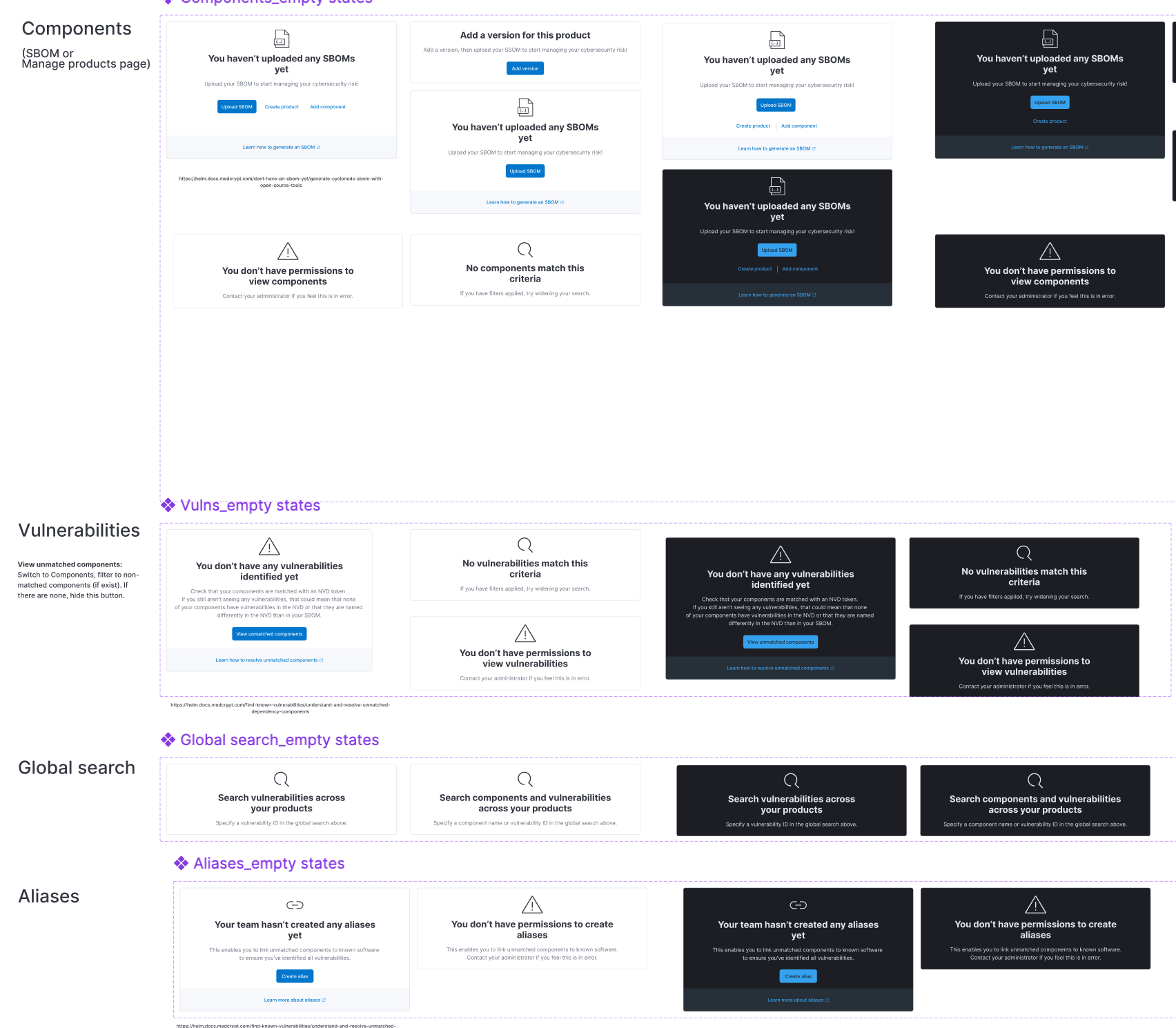
The product was confusing to use and didn't provide for traceability, so I creaated a breadcrumb trail, global search, and avatar drop-down.
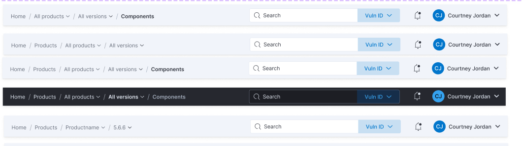
The breadcrumb trail I created allowed for scalability, enabling me to quickly add on organization and workspace, as we acquired more enterprise customers with the need for more complex security.
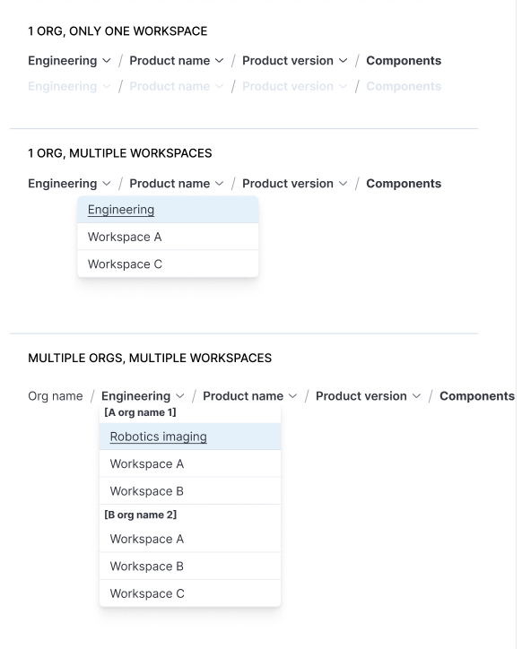
I pushed for breadcrumbs and URLs for traceability, mapping out the breadcrumbs and URL structure of current and future state for every use case, setting the product up for traceability to be added in the future.

Because we couldn't immediately switch from tables to a more intuitive interface for such an information-dense interface, I used a table that enabled users to customize their views, as well as creating in-page dahboards to bring the most important information forward - vulnerabilities that were new or updated, had high exploitability, etc. This was the first iteration of dashboards.

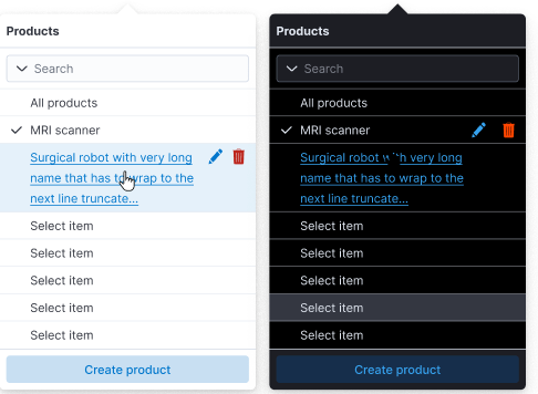
The first thing users needed to do was select a product and product version, but this wasn't immediately clear. The selectors I created needed to allow for multiple products to be selected, as well as the ability to create, edit, and delete items.
This was the initial Get started panel when the product was still in its infancy. It was later replaced with a full-fledged Get started page, featured further below. This helped to build credibility for a product that was very limited at the time, as well as starting to establish value prop.

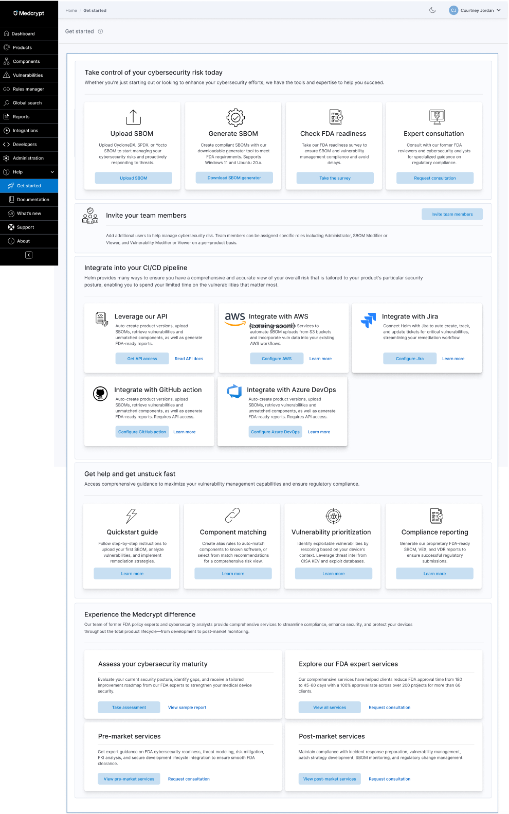
This was the second iteration of the Get started experience, once I had created a help center, the product had evolved in maturity and offerings, and services had evolved. It unified our integrations offerings for the first time and brought forward other tools and upsells that were previously undiscoverable.
I created consistent color variables across both light and dark mode using Figma.
Both components and vulnerabilities had the same main goals, which was to remediate the most exploitable vulnerabilities and have an accurate understanding of your overall risk. From research, we'd found that many companies just wanted vulnerability remediation to be automated so that they didn't have to spend valuable cycles on this. We now had an AI guidance system that collected security advisories and vulnerability information from many sources, so this is integrating that automation to get customers to value quickly.
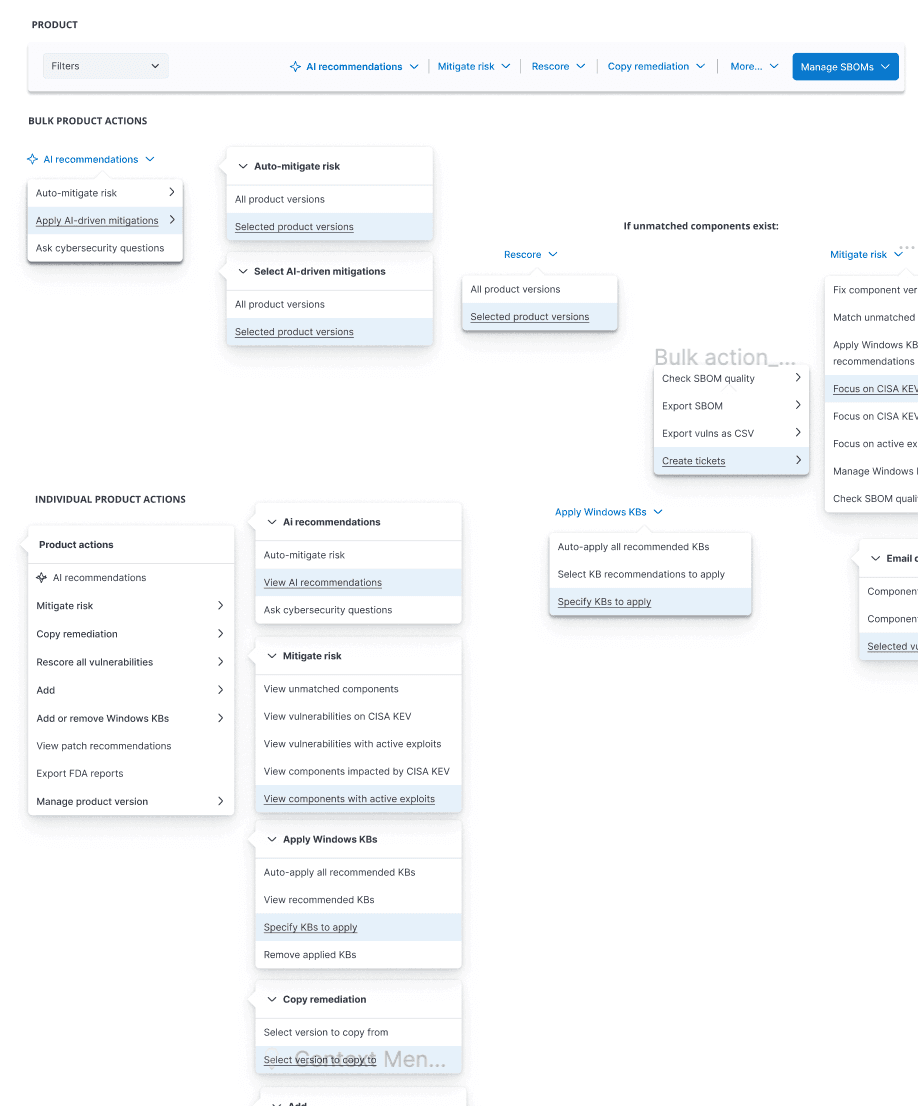
Created toolbar with bulk and individual actions to get users to value quickly.
Because we couldn't immediately switch from tables to a more intuitive interface for such an information-dense interface, I used a table that enabled users to customize their views, as well as creating in-page dahboards to bring the most important information forward - vulnerabilities that were new or updated, had high exploitability, etc. This was the first iteration of dashboards.
Instead of the user trying to guess what next action they should do, this eliminated all uncertainty.
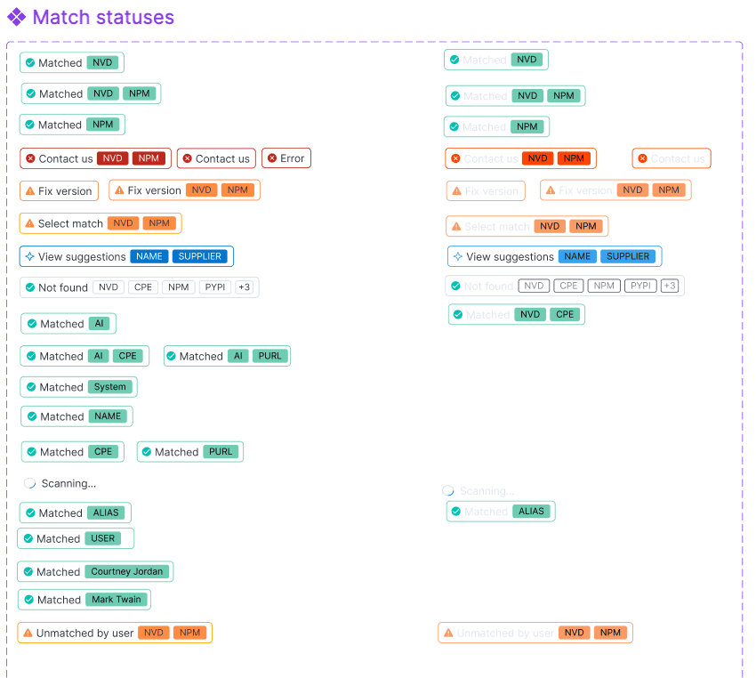
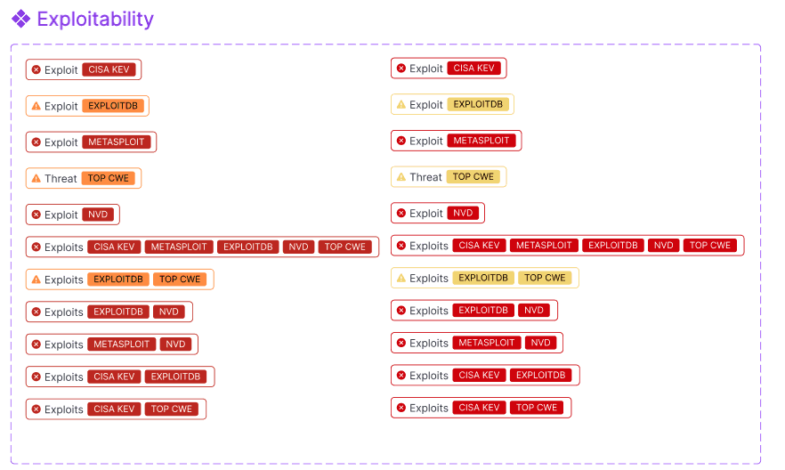
I created a whole badge system to deal with every status, from match to remediation to license risk to lifecycle risk and beyond. Using the principle of connectivity and relatedness, this grouped several previously disparate bits of data into one unified staus. Users could click badges to resolve things like component match status.
Getting your components matched to known NVD software was critical to identifying the associated vulnerabilities.
This showed what was most important to focus on because it had a CISA KEV, Metasploit, ExploitDB, and other exploitability sources.
Processing modals showed the state of the system, how much longer an action should take, and allowing the user to continue working.

To get dashboards ready quickly, I used existing widgets from the ElasticSearch design system for the overview objects, which were somewhat limited, but that design system met more of our needs than other design systems. I created everything else myself.
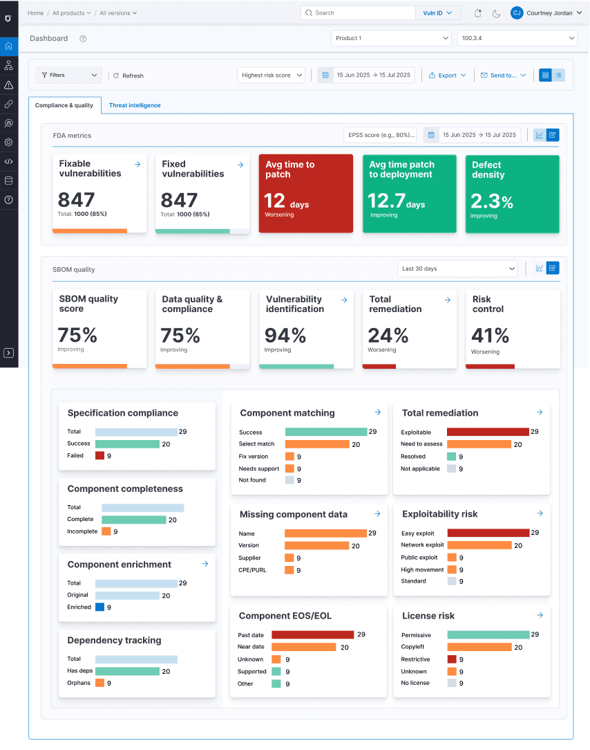
For each table and each dashboard, I determined the categories of filters, as well as what was in each category so that users could quickly drill down on just what they needed. Only the most important filters were shown by default, using progressive disclosure for more granular filtering needs.
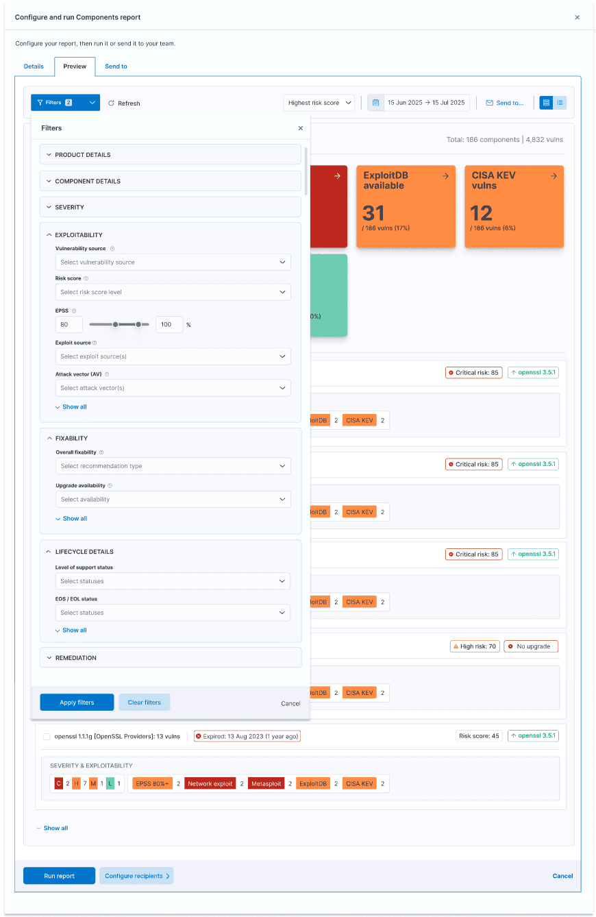
The filter mechanism users progressive disclosure, only showing the most important and most frequently used filters by default.
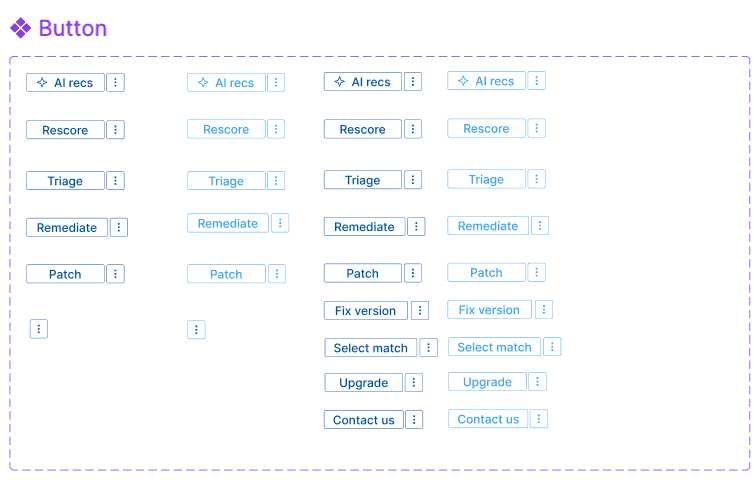
The scalable button system provided for primary, secondary, and tertiary CTAs, as well as button groups for filtering OS lists or rescoring vulnerabilities.

I created a toast system to ensure users always understood system status, as well as a notification center to let them easily pick up where they left off later or respond to important system or external changes, such as updated vulnerability exploitability, new vulnerabilities, automatic rescoring, and much more. I also pushed to ensure that users did not lose their work due to timeouts.
Confirmation modals with corresponding toasts
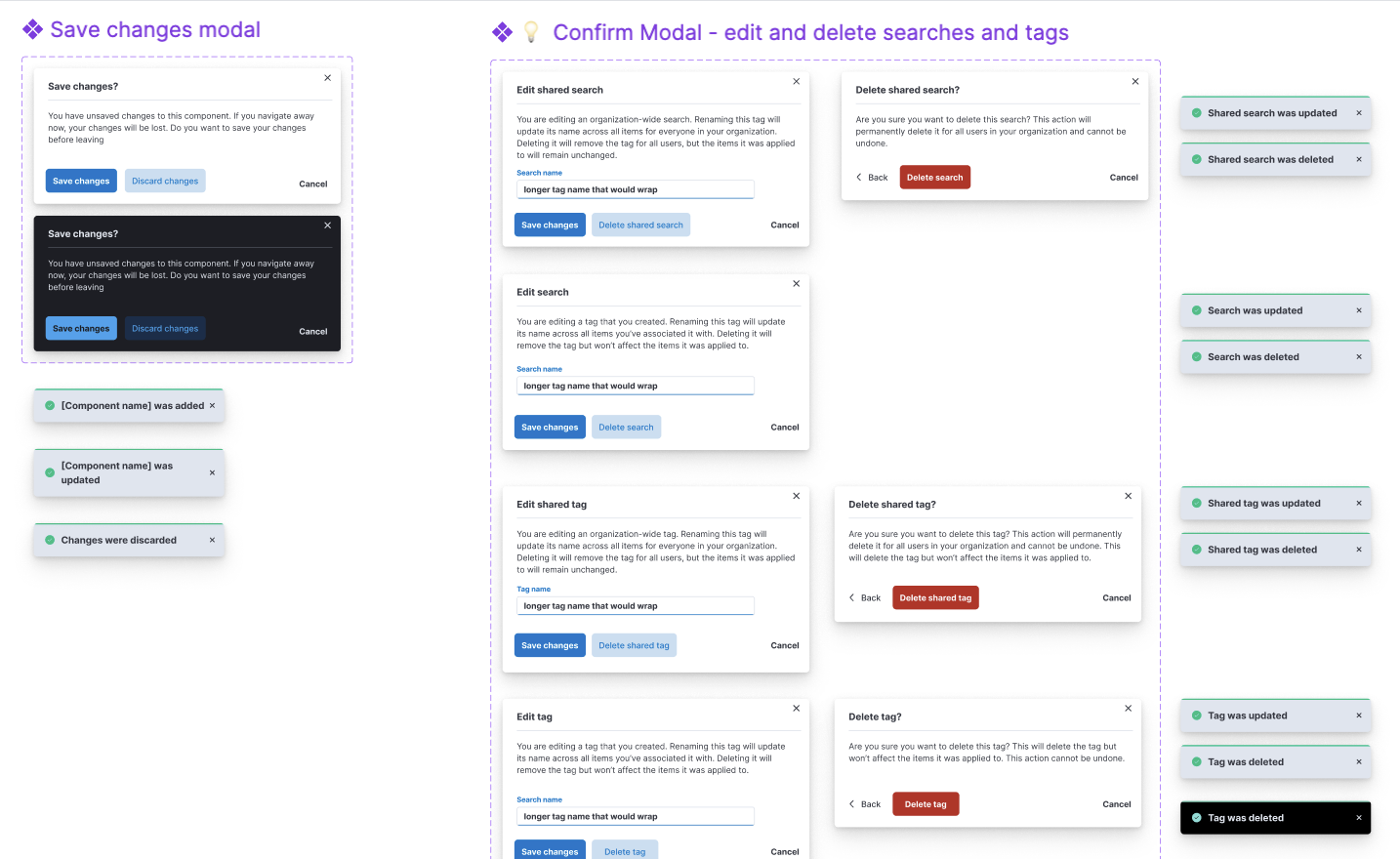
Notifications

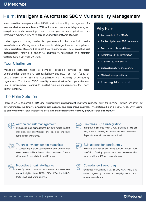
I created the first product datasheet, showing how we could position the product, which enabled our sales and services team to better speak to our product's value, and to distribute at conferences.
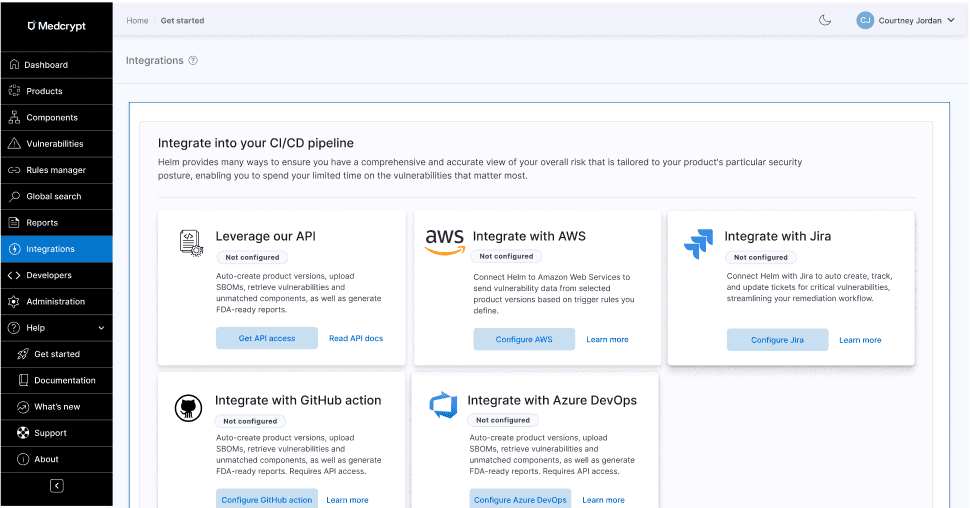
With the addition of a few integrations and our API, but low usage, I pushed for an Integrations hub to improve discoverability.
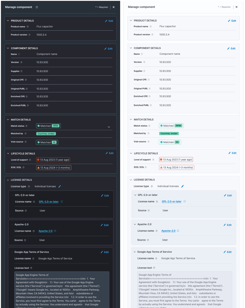
I created panels that met various needs, from one to two columns' width.

Panels in view mode needed to be editable, but allow for quick scannability.
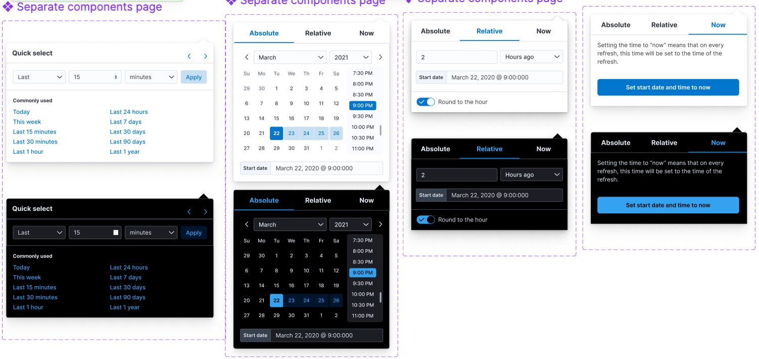
I created a calendar system that handled common use cases, recently used, relative time, and more.
The design system became the foundation for Medcrypt’s transition into a product-led organization.
Results included:
This work set the baseline for Medcrypt’s product design maturity and supported the company’s evolution beyond services into a scalable software platform.